In Academic IELTS Writing task 1, you will have one or more graphs (usually one to three) and you need to summarise the information or write a report about the data presented within 20 minutes. You are advised to write minimum 150 words and less than that would reduce your band score. Some diagrams or graphs are easy to examine and present. However, there are some that require you to observe more closely and plan properly to answer. Here goes the list of such graph questions with links to model answers that many students find difficult to answer.
Difficult Graph Question # 1:
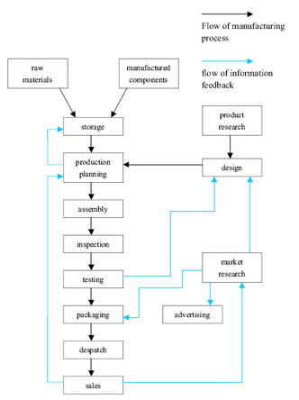
The diagram below shows the typical stages of consumer goods manufacturing, including the process by which information is fed back to earlier stages to enable adjustment.
Write a report for a university lecturer describing the process shown.
Difficult Graph Question # 2:
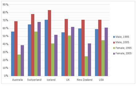
The graph below shows information on employment rates across 6 countries in 1995 and 2005.
Summarise the information by choosing and describe the main idea, and make comparisons where appropriate.
Difficult Graph Question # 3:
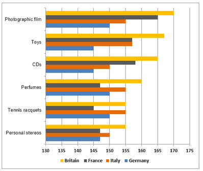
The chart below shows the amount spent on six consumer goods in four European countries.
Write a report for a university lecturer describing the information shown below.
Difficult Graph Question # 4:
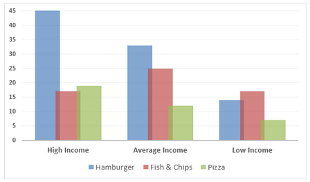
The chart below shows the amount of money per week spent on fast foods in Britain. The graph shows the trends in consumption of fast foods.
Write a report for a university lecturer describing the information shown below.
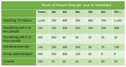
Difficult Graph Question # 5:
The table below gives data on the hour of leisure time per year for people in Someland.
Write a report for a university lecturer describing the information in the table below.
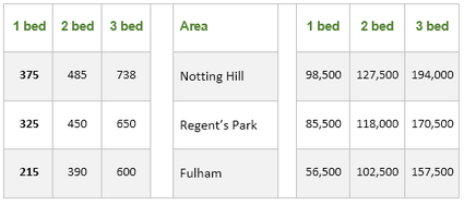
Difficult Graph Question # 6:
The table below provides information on rental charges and salaries in three areas of London.
Write a report for a university lecturer describing the information shown below.
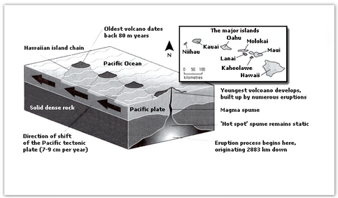
Difficult Graph Question # 7:
The diagram below gives the information about the Hawaiian island chain in the centre of the Pacific Ocean.
Write a report for a university lecturer describing the information shown.
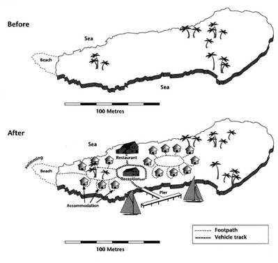
Difficult Graph Question # 8:
The two maps below show an island, before and after the construction of some tourist facilities.
Summarise the information by selecting and reporting the main features, and make comparisons where relevant.
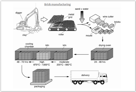
Difficult Graph Question # 9:
The diagram below shows the process by which bricks are manufactured for the building industry.
Summarise the information by selecting and reporting the main features, and make comparisons where relevant.
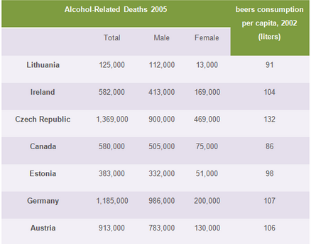
Difficult Graph Question # 10:
The graph below shows the Alcohol-related deaths in 7 different countries and the average beer consumption in 2005.
Summarise the information by selecting and reporting the description of the correlation of the table that follows.
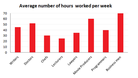
Difficult Graph Question # 11:
The graphs show figures relating to hours worked and stress levels amongst professionals in eight groups.
Describe the information shown to a university/college lecturer.
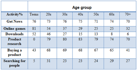
Difficult Graph Question # 12:
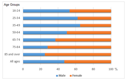
The table below gives information on internet use in six categories by age group.
Describe the information in the table and make comparisons where appropriate.
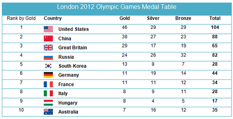
Difficult Graph Question # 13:
The table below shows the number of medals won by the top ten countries in the London 2012 Olympic Games.
Summarise the information by selecting and reporting the main features, and make comparisons where relevant.
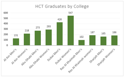
Difficult Graph Question # 14:
The graphs show enrolment in different colleges in the Higher Colleges of Technology in 1999.
Write a report for a university lecturer describing the information given.
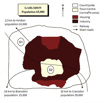
Difficult Graph Question # 15:
The map below is of the town of Garlsdon. A new supermarket (S) is planned for the town. The map shows two possible sites for the supermarket.
Summarise the information by selecting and reporting the main features, and make comparisons where relevant.
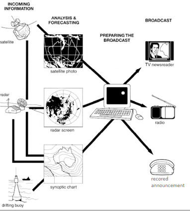
Difficult Graph Question # 16:
The diagram below shows how the Australian Bureau of Meteorology collects up-to-the-minute information on the weather in order to produce reliable forecasts.
Write a report for a university lecturer describing the information shown below.
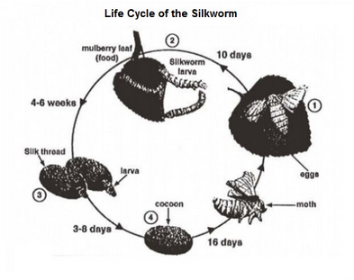
Difficult Graph Question # 17:
The diagrams below show the life cycle of the silkworm and the stages in the production of silk cloth.
Summarise the information by selecting and reporting the main features, and make comparisons where relevant.
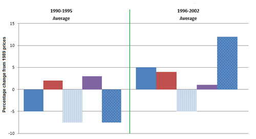
Difficult Graph Question # 18:
The chart below shows information about changes in average house prices in five different cities between 1990 and 2002 compared with the average house prices in 1989.
Summarise the information by selecting and reporting the main features, and make comparisons where relevant.
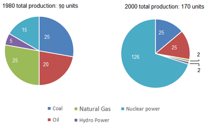
Difficult Graph Question # 19:
The pie charts below show units of electricity production by fuel source Australia and France in 1980 and 2000.
Summarise the information by selecting and reporting the main features, and make comparisons where relevant.
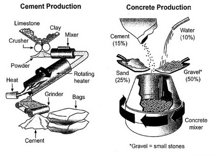
Difficult Graph Question # 20:
The diagram below shows the stages and equipment used in the cement-making process, and how cement is used to produce concrete for building purposes.
Summarise the information by selecting and reporting the main features and make comparisons where relevant.
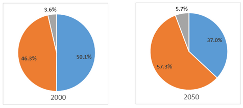
Difficult Graph Question # 21:
The charts below give Information on the ages of the populations of Yemen and Italy In 2000 and projections for 2050.
Summarise the information by selecting and reporting the main features, and make comparisons where relevant.
Difficult Graph Question # 22:
The diagrams show a structure that is used to generate electricity from wave power.
Summarise the information by selecting and reporting the main features, and make comparisons where relevant.

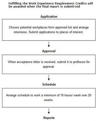
Difficult Graph Question # 23:
The flowchart below shows the process involved in completing the work experience requirement for university students.
Summarise the information by selecting and reporting the main features, and make comparisons where relevant.
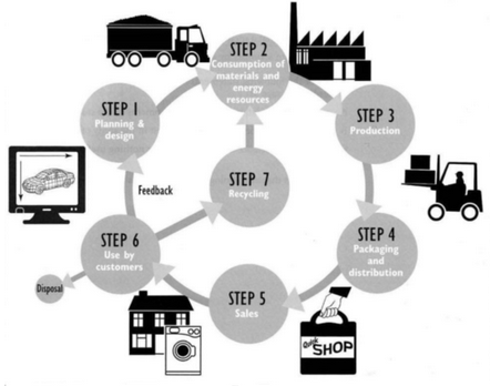
Difficult Graph Question # 24:
The diagram below shows the environmental issues raised by a product over its life cycle.
Summarise the information by selecting and reporting the main features, and make comparisons where relevant.
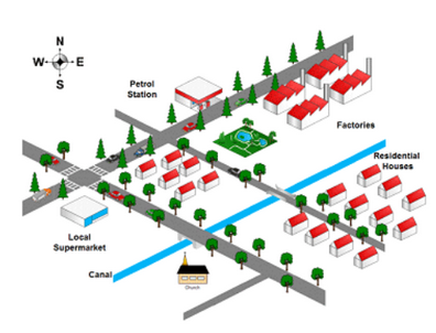
Difficult Graph Question # 25:
The map below shows the changes in an American town between 1994 and 2010.
Summarise the information by selecting and reporting the main features and making comparisons where relevant.
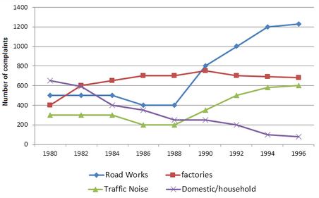
Difficult Graph Question # 26:
The graph below shows the number of complaints made about noise to Environmental Health authorities in the city of Newtown between 1980 and 1996.
Summarise the information by selecting and reporting the main features, and make comparisons where relevant.
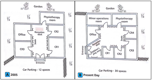
Difficult Graph Question # 27:
Plan A below shows a health centre in 2005. Plan B shows the same place in the present day.
Summarise the information by selecting and reporting the main features, and make comparisons where relevant.
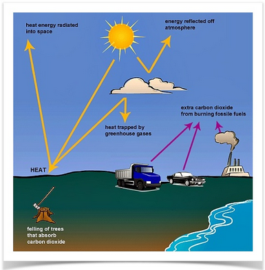
Difficult Graph Question # 28:
The following diagram shows how greenhouse gases trap energy from the Sun. Write a report for a university lecturer describing the information shown in the diagram.
Summarise the information by selecting and reporting the main features and make comparisons where relevant.
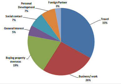
Difficult Graph Question # 29:
The pie charts below show responses by teachers of foreign languages in Britain to a survey concerning why their students are learning a foreign language. The first chart shows the main reason for learning a foreign language. The second chart shows how many teachers felt that there has been a recent change in the reason.
Write a report for a university lecturer describing the information below.
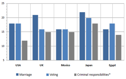
Difficult Graph Question # 30:
The figure shows the results of a survey of 1000 adolescents in five different countries. The participants were asked at what age they believed certain rights and responsibilities should be granted to young people.
Summarise the information by selecting and reporting the main feature.
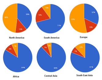
Difficult Graph Question # 31:
The charts below show the percentage of water used for different purposes in six areas of the world.
Summarise the information by selecting and reporting the main features, and make comparisons where relevant.
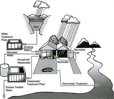
Difficult Graph Question # 32:
The following diagram shows how rainwater is reused for domestic purposes.
Summarise the information by selecting and reporting the main features and make comparisons where relevant.
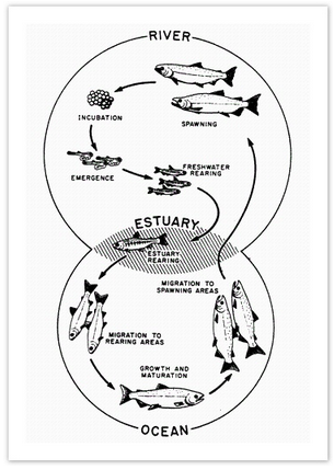
Difficult Graph Question # 33:
The diagram below shows the life cycle of a salmon, from egg to adult fish.
Summarise the information by selecting and reporting the main features and make comparisons where relevant.
Difficult Graph Question # 34:
The bar chart below shows the proportions of English men and women of different ages who were living alone in 2011. The pie chart compares the numbers of bedrooms in these one-person households.
Summarise the information by selecting and reporting the main features and make comparisons where relevant.
Difficult Graph Question # 35:
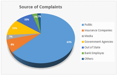
The graphs indicate the source of complaints about the Bank of America and the amount of time it takes to have the complaints resolved.
Summarise the information by selecting and report in the main features, and make comparisons where relevant.
Difficult Graph Question # 36:
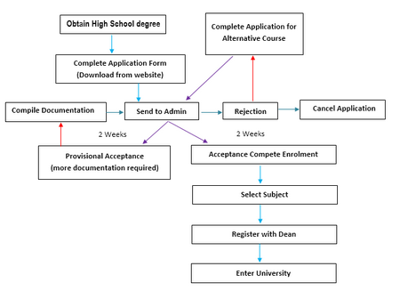
The diagram shows the procedure for university entry for high school graduates.
Summarise the information by selecting and reporting the main features, and make comparisons where relevant.
Difficult Graph Question # 37:
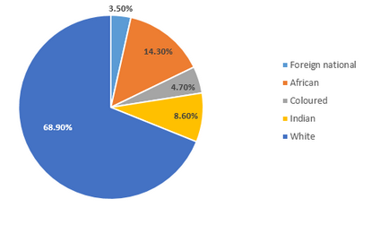
The charts below show the workforce profile at the top management jobs by ethnicity and race in South Africa based on a 2015/16 report.
Write a report for a university teacher describing the information shown in the diagrams below.
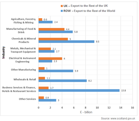
Difficult Graph Question # 38:
The bar chart below shows Scotland’s exports to the rest of the UK and the rest of the world for the year 2014.
Summarise the information by selecting and reporting the main features and make comparisons where relevant.
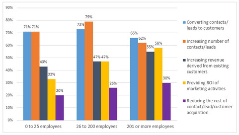
Difficult Graph Question # 39:
The graph below shows the top priorities by business companies in the USA in 2016.
Summarise the information by selecting and reporting the main features and make comparisons where relevant.
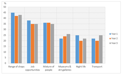
Difficult Graph Question # 40:
The bar charts and line graph below show the results of a survey conducted over a three-year period to discover what people who live in London think of the city.
Summarize the information by selecting and reporting the main features, and make comparisons where relevant.
{jcomments on}


Report