Graph Writing # 40 - Experimental flu vaccine in a large country town on females
- Details
- Last Updated: Saturday, 18 July 2020 22:25
- Written by IELTS Mentor
- Hits: 91971
IELTS Academic Writing Task 1/ Graph Writing - Line Graph + Column Graph + Pie Chart:
» You should spend about 20 minutes on this task.
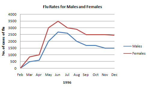
In June 1996, an experimental flu vaccine was trialled in a large country town on females only. The result of this survey is presented in the following illustration.
Summarise the information by selecting and reporting the main features, and make comparisons where relevant.
»You should write at least 150 words.


Model Answer 1:
The illustration outlines the outcome of a flu vaccine trial among females in a big town in June 1996. Overall, the experimental flu vaccine was not effective in terms of its result on females.
The diagrams reveal that flue rate was generally higher among women than that of men in 1996. From April 1996 to June 1996, the infected people’s number increased swiftly and more female became vulnerable to the flu than that of men. At the beginning of June, the number of male patients was somewhat 2500 compared to 3500 females at which point the injection was tested among women. Though it might seem that the flu contamination among female decreased afterwards, the overall flu rate among males gives a different scenario. During August until the end of the year, around 2500 females were recorded to have flue while this number was a thousand fewer for males.
Interestingly, only 1 female died from flu during March to May 1996, but after the vaccination, the death case rose – 4 female and 2 male death cases were recorded between June and August.
Finally, almost a quarter of female child and 35% elder females were at risk despite the immunization. 13% needed medical attention while just over a quarter who did not receive the injection were also at risk.
Sample Answer 2:
The graphs provide the results of a survey on the flu vaccine trial conducted in a large country town on females in June 1996.
Overall, despite the vaccination, more females were affected by the flu and the death rate was also higher in females, especially among older women.
The line graph illustrates the prevalence of the flu among both genders. As seen from the graph, from February to April, a steep increase in flu rates was seen - 1000 females and around 600 males. In the middle of the year, a dramatic increase was noticed; reaching a peak of 3500 in females and above 2500 in males in June at which point the injection experiment was done. Although the flu rates began to drop after June, prevalence was still higher among females (2500) as compared to males (1500).
The bar graph illustrates the death rate from flu; from June to August, 4 women died, while only 2 men had expired. In contrast, from March to May, no male mortality was reported and 1 woman died.
Finally from the pie chart, despite immunization over a quarter of girls and 35% of geriatric women were at more risk than other females from other age groups.
[Written by - Safna Mariyam]
Model Answer 3:
The diagrams present results of a survey conducted in a big municipality on the flu vaccine to women in June 1996. Generally speaking, more females were affected by the flu than men did and death rate among women from the flu was also higher.
As the data suggests, from February to June, the number of flu infection steadily increased. More females were affected by flue than men did and in the middle of the year, this infection spread among more than 3500 female and more than 2500 men at which point the injection experimented. The infection rate in the rest of the year remained constant - 2500 females and 1500 males.
The bar graph shows the death cases from the flu and it is obvious that female death case was higher than the male mortality event. From June to August, 2 men died from the flu infection where 4 women departed from the same flu.
Finally, the pie chart presents data on the aftermath of the vaccination. It can be observed that older women and children were at more risk than other age groups of females.
( This model answer can be followed as an example of a very good answer. However, please note that this is just one example out of many possible approaches.)


No cases were reported in February 1996, but the number of infections reached approximately 1500 after two months, with females accounting for approximately two-thirds. Caseload tripled among women in May and peaked at 3500 in June. A similar trend can also be seen among men, but the highest number was just around 2700. During the rest of the year, cases decreased and flattened off since September, as caseloads among men and women in December 1996 were 1500 and just under 2500, respectively.
Fatalities among women stood at 5 between March and August, one of which happened between March and May. From June to August, 2 men died from flu. As for the pie chart, females over 65 represented more than one-third of the risk, which tripled the figure regarding those hospitalized. Nearly every 3 out of 10 women not given the vaccine, as well as 1 out of four female babies and children were in danger.
Report