Graph Writing # 151 - Monthly household income spent on various items by two groups
- Details
- Last Updated: Tuesday, 25 August 2020 23:55
- Written by IELTS Mentor
- Hits: 71826
IELTS Academic Writing Task 1/ Graph Writing - Pie Charts:
» You should spend about 20 minutes on this task.
The charts below show the percentage of monthly household income spent on various items by two different groups in one European country.
Summarise the information by selecting and reporting the main features, and make comparisons where relevant.
» Write at least 150 words.
Percentage of Household income spent on different items*
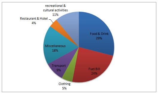
LOW-INCOME GROUP
Percentage of Household income spent on different items*
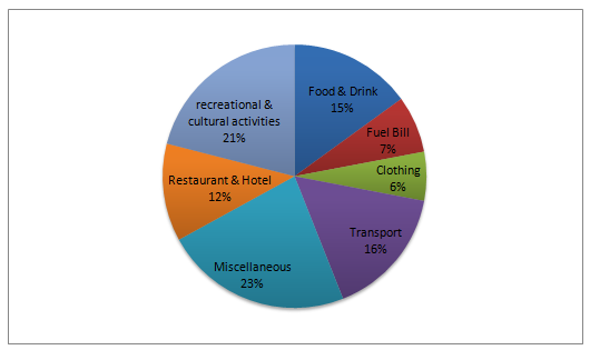
HIGH-INCOME GROUP
* Earnings Excluding House rent/ purchase
Sample Answer 1:
The pie charts illustrate the proportion of household expenditure by two income groups in Europe. In general, it is clear that house rent is not included in the two pie charts.
First of all, the low-income group spends the most money on food and drink which accounted for 29% of the total income, while the high-income group spends only 15%. It is clearly shown that high-income earner spends the majority of the income on miscellaneous items (23%) whereas only 18% allocated them for the low-income earner. Those who earn less money spend more money on fuel bills than the high-income group (24% and 7% respectively). A direct link can be seen between money spent on transport and fuel bills, that is transport makes up a smaller proportion in the low-income group than high-income group (9% for the former and 16% for the latter).
Another interesting feature is that the low-income earners spend less money on recreational and cultural activities compared to the high-income group, with figures 11% and 21% respectively). For both the income groups, less money is spent on restaurant and hotel and clothing, that is 4% and 5% for low-income group and 7% and 8% for the high-income group.
[Written by - Lee Wing Qeen]
Sample Answer 2:
The pie charts compare the proportion of monthly domestic cost allotted for 7 categories, namely: food and drinks, fuel bill, clothing, transport, miscellaneous, restaurant and hotel and lastly, recreational and cultural activities. The first chart illustrates the expenditures of the low-income group and the second pie chart shows how the high-income group spent their income. Both charts pertained to one of the countries in Europe.
It is evident that the low-income group spent the largest proportion of their income on food and drinks while the high-income group allotted the majority of their salary for miscellaneous items. Meanwhile, the tiniest percentage of expenditure for lesser income group was for the restaurant and hotel while for the higher income group, this was for clothing.
In detail, poor people prioritised food and drinks and this item demanded 29% of their wages unlike with rich persons, as it was only on their 4th priority with only 15%. Surprisingly, the low-income group spent more on fuel bill compared to the high-income group with 24% and 7% respectively. However, in the remaining categories, rich people had higher expenditures. For instance, rich individuals spent 21% of their wages on recreational and cultural activities while poor individuals allotted only 11% for this category. Interestingly, the high-income group spent an enormous proportion of the miscellaneous category (23%) while the low-income group allotted only 18%. Also, rich individuals spent more on transportation (16%) than poor people (9%). Similarly, both categories have less than 10% spent on clothing.
[Written by - Jehdeiah]


Report