IELTS graph 252 - Effect of flu vaccination in a town
- Details
- Last Updated: Thursday, 10 August 2017 15:12
- Written by IELTS Mentor
- Hits: 13154
IELTS Academic Writing Task 1/ Graph Writing - Bar Graph + Pie Chart + Line Graph:
» You should spend about 20 minutes on this task.
In April 2006, an experimental flu vaccine was trialled on females in a large town. The graphs outline the effect of this vaccination in this town.
Write a report for a university lecturer describing the information shown in the diagrams below.
Write at least 150 words.
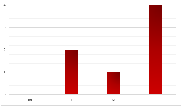
Number of Deaths in 2005 - 2006
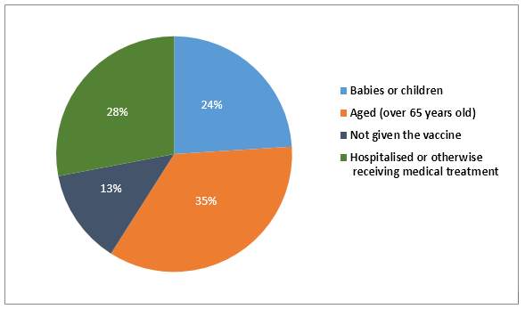
Percentages of complaints recorded after the vaccination
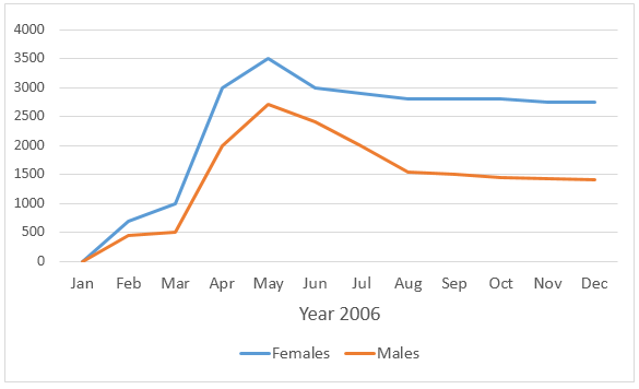
Flue Rates for Males and Females
Sample Answer:
The bar graph shows the number of deceased people in a town in 2006, the year when a flu vaccine was trailed, the pie chart presents the ratio of complaints from different patients due to vaccinations and finally the line graph outlines the flu rates among people in this town throughout the year.
According to the bar graph, 2 females died in the town in question in 2005 while no male death was recorded in this year. In 2006, the year the flu vaccine experimented on females in this town, 4 women passed away. However, a male also died in 2006.
The pie chart reveals that the highest percentages of complaints (35%) came from the elderly women (over 65 years). Almost a quarter of the total objections were related to adolescents and 13% related to women who were not given the vaccine. 28% of those objections were made by people who were under medical treatments.
The line graph shows that the flu rate among females was higher throughout the years. In March 2003 around 1000 females suffered from the flu while this was exactly the half among men. After the vaccination in April 2006, the flu cases actually surged. In May 2006, 3500 females had some kind of flues while just over 2500 men suffered from it. After August, the number of cases stabilized but was higher than the earlier of the year, around 2750 cases for female and just below 1500 for men.


According to the bar graph, more females died within the given one-year period. In detail, the flu killed 2 women in 2005 and the number of fatalities doubled a year later. No casualties had been reported among males in the previous year before one man passed away in 2006.
The pie chart reveals that 35% of the negative feedback towards the vaccination came from elderly people. People who were under treatments or hospitalized represented almost 30% while this figure regarding babies and children stood at approximately a quarter. \
Looking at the line graph, it can be seen that flu rates were higher among women than men in 2006. In March, female cases reached exactly 1000, which doubled the number of cases among the opposite gender. The figures rose dramatically after a month, to 2000 for men and 3000 for women, then both reached the highest point in May. Afterwards, they decreased and flattened off and by the end of the year, female cases stood at around 2800 and male cases were almost 1500.
Report