IELTS Academic Writing Task 1/ Graph Writing – Bar Chart + Table + Line Graph:
» You should spend about 20 minutes on this task.
The charts below show the growth in the population in some of the world’s largest cities as well as the population distribution in urban and rural areas.
Summarise the information by selecting and reporting the main features, and make comparisons where relevant.
You should write at least 150 words.
Population in millions
Top 5 biggest cities by population (millions)
World population in billions

Model Answer 1:
The charts compare population growth in five large cities between 1970 and 2010, and also show how the global population was distributed between urban and rural areas.
Overall, all five cities expanded, but Bombay and Jakarta grew the fastest, while Tokyo remained the most populous throughout. At the same time, the world experienced a major shift towards urban living.
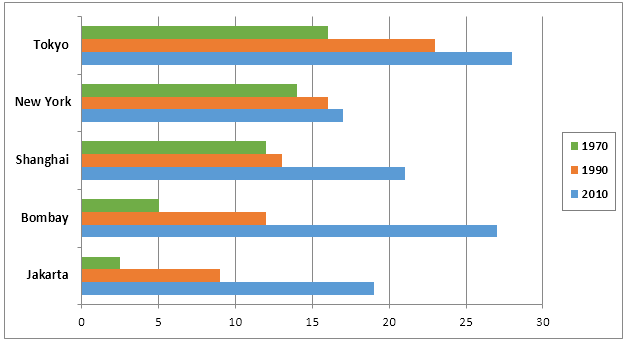
Looking first at the cities, Tokyo had the largest population in every year shown, rising from roughly over 16 million in 1970 to around 27 million by 2010. In contrast, the population in New York and Shanghai grew more steadily and far less dramatically. New York’s population increased from about 14 million to almost 17 million over the period, while Shanghai’s population climbed from approximately 12 million to around 21 million in 2010. The most striking changes in population occurred in Bombay and Jakarta. Their population growth outpaced all other cities. Bombay’s population grew from a mere 5 million in 1970 to roughly 27 million in just 4 decades.
Turning to global population distribution, around 3 billion people lived in rural areas in 1980, compared with under 2 billion in cities. Urban population numbers increased steadily across the following decades, overtaking rural residents by the mid-2000s and reaching over 4 billion by 2010.
Sample Answer 2:
The bar graph compares the population in five metropolitan areas in 1970 and 2010, while the table lists the top five cities with the highest population. Finally, the line graph compares urban and rural population distributions from 1980 to 2010.
Generally speaking, population growth in Bombay and Jakarta was faster than in other listed cities, and Tokyo had the highest population in 2010. Moreover, a higher number of people started living in urban areas than in rural areas after 2005.
In detail, more than 15 million people lived in Tokyo in 1970, and that was higher than that of New York, Shanghai, Bombay and Jakarta. The population in Bombay was one-third that of Tokyo. Moreover, Jakarta had only 2.5 million residents, the least among the five cities. The population in Tokyo increased to 27.6 million in 2010, and was listed as the city with the highest population. However, population growth in Bombay and Jakarta was higher than in other cities.
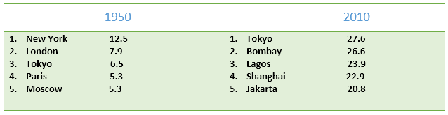
The table data shows that New York was the most populous city in the world in 1950, with exactly 12.5 million residents. London and Tokyo stood at the second and third positions in this list, while Moscow – with its 5.3 million people – was in 5th position. In 2010, Tokyo topped the rank, followed by Bombay and Lagos.
Finally, globally, three billion people lived in rural areas in 1980, while less than 2 billion lived in cities. In 2010, the number of city-dwellers upsurged to over 4 billion, while it was slightly over 3 billion in rural areas.
Model Answer 3:
The bar graph compares population growth in five large cities between 1970 and 2010, while the table lists the five most populous cities in the world both in 1950 and 2010. In addition, the line graph analyses the global population distributions in rural and urban areas.
Overall, Tokyo had the largest population in 2010, but population growth in Bombay and Jakarta outranked the listed cities. Finally, more people started to live in cities after 2005 despite a different scenario in earlier years.
As the data suggests, Tokyo had over 15 million residents in 1970, which was three times and five times higher than that of Bombay and Jakarta, respectively. New York and Shanghai had approximately 14 and 12 million inhabitants this year. After two decades, New York witnessed a meagre population growth, while it was dramatic both in Jakarta and Bombay. It is evident that population growth in Jakarta and Bombay exceeded that of all other cities listed in the graph.
In 1950, New York, London, Tokyo, Paris and Moscow were the top five most populous cities in the world. In 2010, Bombay, Lagos, Shanghai and Jakarta ranked in the list by eliminating all other cities except Tokyo, which stood first on the chart with over 27 million citizens.
Finally, the global urban population in 1980 was below 2 billion, while 3 billion lived in villages. The population in cities grew steadily and exceeded 4 billion in 2010, at which point 3 billion global population lived in rural areas.
Excuse me, can you interpreter the line:
Population growth in Bombay and Jakarta, almost 5.5 times, was higher than any other city listed. It’s because, from the data, Jakarta has the least number, which is 20.8.
I know it’s a bit late, but as far as I’m concerned what they tried to mean there is the level of growth, not exactly the size of the population, which increased around 5.5 times over the period from 5 to 27 for Bombay, from 3 to 18 for Jakarta.
The bar chart compares the population in the five cosmopolitan cities during 1970 and 2010 while the table lists down the five populous cities in the world in 1950 and in 2010. In addition, the line chart shows changes in the global population between urban and rural areas during 30 years.
The bar chart illustrates the population growth in five large municipalities between 1970 and 2010, while the table lists the top five cities with the highest population. Finally, the line graph depicts how urban and rural population was distributed in 1950 and 2010.
Overall, Bombay and Jakarta witnessed the fastest population growth, whereas Tokyo withstood the top rank for the most populous cities in 2010. Moreover, urban areas became more populated than rural areas after 2005.
In 1970, Tokyo had the highest residents, nearly 16 million, as opposed to Jakarta with less than 3 million. The population growth by 1990 was relatively the same in some cities; however, it was notoriously higher in Bombay. In 2010, although Shanghai and Jakarta experienced a rapid increase in population, about 22 and 19 million respectively, the most significant upsurge occurred in Bombay, with over 25 million residents. In 1950, New York occupied the first position, in terms of population, with 12.5 million while Moscow stood at fifth. But In 2010, Tokyo ranked highest with 27.6 citizens, followed by Bombay and Lagos, 26.6, 23.9 million people consecutively. Between 1980 and 1990, the major concentration of population was in rural areas, 3 billions of city people in contrast with 2 billion in urban areas. In 2010, 4 billion people had been living in cities compared to a billion fewer in villages.
This report is 295 words. It is insane. We should keep at 180 as maximum, more than that reveal our unavailability to summarize the visual.
I think you should use ‘while’ rather than ‘and’ to separately describe the bar graph and the table.
Can I write the introduction like this? “The bar chart depicts the population growth rate in world’s five capital cities and in different years and the table shows the number of people for these cities in million in 1950 and 2010. Moreover, the line graph illustrates populace in billion from 1980 to 2010.”