IELTS Academic writing task 1 – Line Graph
A line graph (also known as a line chart) is a graphical presentation of data that changes over time. It uses lines to connect data points and show changes. The X and Y axes are used to denote the changes in the data visually. While the title of the line graph shows the general overview of the data, the X-axis presents the occurrences and categories being compared, and the Y-axis shows the scale, which is a set of numbers and values. The scale/number in the Y-axis is organised in equal intervals to present the data more visually.
Line graphs are quite versatile, and it is an extensively used family of graphs. Line graphs are quite common in the Academic IELTS tests. If you are planning to take the IELTS test, you must understand how to write a report or a summary based on a given line graph. A line graph can contain one or multiple lines to show changes over time and comparisons among different items. A single line is comparatively easier to describe, and with the increase in line number, it can become quite complex sometimes.

If your Academic Writing Task 1 contains a line graph, you will need to write a summary/ report of a minimum of 150 words based on that graph within 20 minutes.
Links to all Line Graph pages:
Line Graphs with model answer: Part 1 (Current Page) | Part 2 | Part 3 | Part 4 |
Following is a list of IELTS Line Graph sample questions with model answers for your preparation for the Academic IELTS test.
IELTS Line Graph Sample 1- with model answer
[Line Graph Question: The graphs below show the numbers of male and female workers in 1975 and 1995 in several employment sectors of the Republic of Freedonia.]

IELTS Line Graph Sample 2 – with model answer
[Line Graph Question: Eating sweet foods produces acid in the mouth, which can cause tooth decay. (High acid levels are measured by low pH values)]

IELTS Line Graph Sample 3 – with model answer
[Line Graph Question: The line graph below shows the number of annual visits to Australia by overseas residents. The table below gives information on the country of origin where the visitors came from.]

IELTS Line Graph Sample 4 – with model answer
[Line Graph Question: The graph shows Underground Station Passenger Numbers in London.]

IELTS Line Graph Sample 5 – with model answer
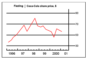
[Line Graph Question: The chart and graph below give information about sales and share prices for Coca-Cola.]
IELTS Line Graph Sample 6 – with model answer
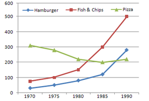
[Line Graph Question: The chart below shows the amount of money per week spent on fast foods in Britain. The graph shows the trends in consumption of fast foods.]
IELTS Line Graph Sample 7 – with model answer
[Line Graph Question: The line graph shows estimated sales of gold in Dubai for 12 months in 2002 in millions of Dirhams. ]

IELTS Line Graph Sample 8 – with model answer
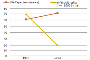
[Line Graph Question: The graphs below show the Expenditure on Health & Education, UAE as percentage of GDP and Infant mortality and life expectancy.]
IELTS Line Graph Sample 9 – with model answer
[Line Graph Question: The charts below show the percentage of food budget the average Australian family spent on restaurant meals in different years. The graph shows the number of meals eaten in fast food restaurants and sit-down restaurants.]

IELTS Line Graph Sample 10 – with model answer
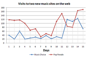
[Line Graph Question: The graph below compares the number of visits to two new music sites on the web.]
IELTS Line Graph Sample 11 – with model answer
[Line Graph Question: The graph and table below give information about water use worldwide and water consumption in two different countries.]

IELTS Line Graph Sample 12 – with model answer
[Line Graph Question: In June 1996, an experimental flu vaccine was trialled in a large country town on females only. The result of this survey is presented in the following illustration.]

IELTS Line Graph Sample 13 – with model answer
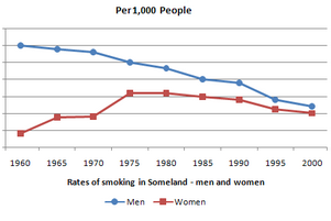
[Line Graph Question: The graph below shows the rate of smoking per 1000 people in Someland from 1960 to 2000.]
IELTS Line Graph Sample 14 – with model answer
[Line Graph Question: The charts below show the percentage of food budget the average family spent on restaurant meals in different years. The graph shows the number of meals eaten in fast food restaurants and sit-down restaurants.]

IELTS Line Graph Sample 15 – with model answer
[Line Graph Question: The charts below show the number of Japanese tourists traveling abroad between 1985 and 1995 and Australia’s share of the Japanese tourist market.]

IELTS Line Graph Sample 16 – with model answer
[Line Graph Question: The line graph below gives information on cinema attendance in the UK. ]

IELTS Line Graph Sample 17 – with model answer
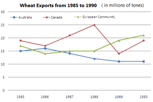
[Line Graph Question: The graph below shows the differences in wheat exports over three different areas. ]
IELTS Line Graph Sample 18 – with model answer
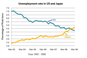
[Line Graph Question: The graph below shows the unemployment rates in the US and Japan between March 1993 and March 1999.]
IELTS Line Graph Sample 19 – with model answer
[Line Graph Question: The graph below shows the demand for electricity in England during typical days in winter and summer. The pie chart shows how electricity is used in an average English home.]

IELTS Line Graph Sample 20 – with model answer
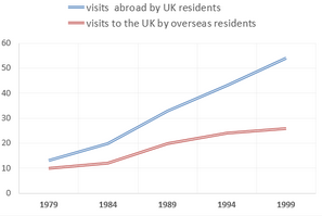
[Line Graph Question: The charts below give information about travel to and from the UK, and about the most popular countries for UK residents to visit.]
I need some ideas.
I really appreciate this site. It helps me to have an ample idea about how to deal with academic types of writing; to write out a pie chart or a line graph.
The graph below shows the differences in wheat exports for three different regions. Write a report for a university lecturer describing the information below. Write at least 150 words.
A great collection of line graphs. Practise from this website, and enhance your confidence.
🙂
A good deal of IELTS practice materials.
Just wish to say your IELTS Samples are amazing. The clearness in your publish is simply spectacular. Thanks, dude.