IELTS Writing Preparation: Academic Writing Task 1
Things you should know about Academic Writing Task 1:
• You are asked to describe information presented in the graph/ table/ chart/ diagram.
• You have 20 minutes to finish the task, and you have to write at least 150 words.
• If you are asked to use the information presented in the graph, you must be careful not to copy it.
In Academic Writing task 1, candidates are assessed on their ability to:
• Organise, present and possibly compare data.
• Describe the stages of a process or procedure.
• Describe an object or event or sequence of events.
• Explain how something works.
The general format for writing an academic writing task 1 is as follows:
Introduction + Basic/General Trends + Details Description + Conclusion/Summary (Optional).
The IELTS Academic writing task 1 requires a certain vocabulary. Each of these parts has a specific format, and therefore being equipped with the necessary vocabulary will help you to write Task 1 efficiently and will save a great deal of time. Before you go through the details of how to write Academic Writing task 1, you must learn the necessary vocabulary and words first to write a better answer.
« Click here to learn the vocabulary »
Well, now you know the structure and vocabulary for the Academic Writing Task 1, let’s go ahead…
Four steps should be followed to write a better Academic writing task 1:
1. What type of presentation is it, and what is it asking?
2. Collecting data/information.
3. Planning for writing.
4. Representing in an organised form.
First Step: Analyse.
Analyse the question first. Look whether it is a diagram / table /figure / illustration / graph / figure / chart / flow chart, or a picture. Now look at what the question is asking to do. For example, the question might ask to compare, contrast, analyse, summarise or more than one thing.
Second Step: Collecting data/information.
You must collect/ understand the following data and information from the figure.
a) Time: Be sure whether the time presented in the graph/ figure is present/ past/ future or a mixture of these three. Your writing has to be in the correct tense according to the time presented.
b) Theme: Be sure what the figure/ diagram/ picture is trying to represent.
c) Place and Position: About what place or field are the data all about?
d) Main Point: What’s the central idea of the presented graph/ diagram?
e) General Trend: Figure out the General Trend(s).
f) Effects & Result: Find out the effects and results.
g) Conclusion: Plan what you should include in the conclusion.
Example:
You should spend about 20 minutes on this task.
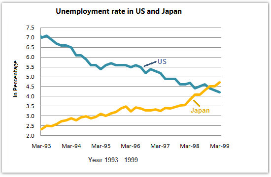
The graph below shows the unemployment rates in the USA and Japan between March 1993 and March 1999. Summarise the information by selecting and reporting the main features and make comparisons where relevant.
You should write at least 150 words.
First Step (worked out): Analyse:
It is a line graph with 2 lines. The graph is asking to summarise the main features of the unemployment rate.
Second Step (worked out): Collecting data/information:
Time: From March 1993 to March 1999.
Theme: Unemployment rates of the USA and Japan.
Place and Position: USA and Japan.
Main Point: The unemployment rate has decreased in the USA and has increased in Japan.
General Trend: Initially unemployment rate was higher in the USA than in Japan, but over the period, the USA managed to reduce the rate, and in the case of Japan, the reverse was true.
Effects & Result: Effects: unknown. Result: as General Trends.
Conclusion: The Unemployment rate was higher in the USA than in Japan, but over the period, the USA managed to reduce the rate, and in the case of Japan, the reverse was true.
Third Step: Planning:
You should make a plan after you are done with the first 2 steps. This step involves the following orders.
a) Writing a balanced Introduction.
b) Writing a general trend.
c) Detailed description of the figure, and supporting the description.
d) Describing the results.
e) Writing the conclusion.
How to write a balanced introduction:
The introduction part of a writing is very important, hence it reflects your writing skills. Readers decide whether to read further or completely avoid the whole writing after reading the introduction. So in every writing introduction part should be very organised. In the case of IELTS academic writing task 1, you should use the following structure and vocabulary to write a balanced introduction.
What it is (table/ graph/ chart/ diagram/ picture/ flow chart) + What it does (presents data/ shows comparison/ summarize / contrast/ give projection or prediction) + What about (in this case the unemployment rate) + Place (in this case US and Japan) + Time (in this case 1993 to 1999) + Presentation of X and Y axis (here X axis represents time and Y axis represent percentage of work force) + Other relevant information.
Example: The provided line graph provides information on unemployment rates in the USA and Japan from March 1993 to March 1999. Here, the bold line represents the unemployment rate of Japan and the dotted line for the USA. In the provided line graph, the X axis shows time with a one-year interval, and the Y axis represents the unemployment rate.
How to write a better general trend:
The general trend part should be immediately after the introduction part. It is recommended to write the general trend parts in the same paragraph as the introduction. The general trend part should focus on the main point of the presentation and should not be too large with lots of information. However, you should not give the specific figure, time, amount or data presented in the graph; rather, try to use daily life English to make the main reader interested in the whole writing. You can use phrases like As is presented/ as is observed / in general / in common etc. to start this part.
Example: As is observed from the graph, initially in 1993, the unemployment rate in the USA was significantly higher than that of Japan. But over the 6 years, the USA managed to reduce this rate, and the reverse was true for Japan, where the unemployment rate increased in these 6 years.
How to write an attractive description:
The Detailed description part comes after the introduction and general trend and should be written in the second paragraph. In this part, you should describe the graph/ table/ chart/ diagram etc. While describing, keep in mind that you are not expected to write down all the data provided in the question, but rather your ability to describe the presentation in general English.
» Use the appropriate tense to describe the data.
» Use transitional words like – besides, as well as, likewise, in addition, additionally, again, on the other hand etc., to make your sentences relevant and coherent.
» Try to mention the initial, highest, lowest and projection points.
» Do not describe all the data and facts presented in the graph.
» Don’t include your own opinion, imagination or solution.
» DO NOT use contractions (can not=can’t, do not =don’t etc, will not=won’t) in your writing.
If you want to and really need to describe the result of the graph, then write it at the end of the detailed description. However, if results-writing makes something repeated (those that have already been described), then you do not need to write the results.
Example: The USA managed to decline their unemployment rate from 7% to almost 5% in 6 years, but on the other hand, the rate has increased in Japan from only 2.5% to approximately 5%.
How to write a good and efficient conclusion:
The conclusion is an important part of the whole writing, and that is why you must be careful to write a better conclusion. The conclusion part of the Academic IELTS writing 1 is also known as summarising. So write down the main point/theme of the graph in short. You should never include your own point of view, personal opinion or suggestion to solve a problem in the “conclusion”. In some cases of Academic IELTS writing task 1, it is optional to write the conclusion, hence the data are already described and summarised before the conclusion. However, if you need to write the conclusion part, use one of the following words to start the sentence:
In conclusion / in short / to conclude / to sum up / in brief / in summary etc.
Example: In conclusion, the unemployment rate in the USA decreased in 6 years, and the opposite scenario was true for Japan.
The line graph illustrates information about the unemployment rate between two countries (the USA and Japan) in the period of six years, from March 1993 to March 1999. Here, the blue line presents the unemployment rate of the USA, and the yellow line presents the unemployment rate of Japan. In the provided line graph, the X axis shows time with a one-year interval, and the Y axis shows the rate of unemployment in percentage.
Overall, the rate of unemployment in the USA decreased over time; in contrast, the rate increased in Japan during this period. In March 1993, the USA had the highest rate of unemployment, which was about 7%. At that time, Japan had only a 2.4% unemployed population. In addition to that, the rate of unemployed people in Japan increased year by year from 1993 to 1999, but over the 6 years, the USA managed to reduce this rate. The USA managed to decline their unemployment rate from 7% to almost 5% in 6 years, but on the other hand, the rate has increased in Japan from only 2.5% to approximately 5%.
In conclusion, the unemployment rate in the USA decreased over 6 years, and the opposite scenario was true for Japan.
Nothing but great.
Wow, I’m new to this and it’s really great to have all the information I need here. I think I can achieve such great results in passing the test!!! Thanks a lot for the useful information!!!
I’m a student, so I need some information. I think this is the best place for that.
The graph illustrates the ratio of unemployed people in the United States of America and Japan from March 1993 to March 1999.
Overall, fluctuations occurred in both Japan and USA in terms of measuring the number of jobless people in percentage, but the two countries showed different results at the end of 1999. Japan’s population of unemployed citizens went up while the percentage of America’s unemployed people dramatically decreased.
From 1993 to 1996, we can see a visible increase of being unemployed in Japan with minimal fluctuations occurring from 1996 to 1998 but with the same result of 3.5 per cent. For only about a year since 1998, the state of being jobless greatly increased to approximately 4.8 per cent.
In the United States which had a different scenario, the percentage of jobless citizens enormously dropped from 7 per cent to nearly 5.4 per cent from March 1993 to 1995. Fast forward to 1999, the rate of unemployed citizens in America overwhelmingly dropped to 4.2 per cent in 1999.