IELTS Writing Task 1 (Academic)
Practice 1:
» You should spend about 20 minutes on this task.
The graphs below show the numbers of male and female workers in 1975 and 1995 in several employment sectors of the Republic of Freedonia.
Write a report for a university teacher describing the information shown.
» Write at least 150 words.


First Step- Analyse:
Two line graphs are given in the question. These graphs should be described by comparing/ contrasting main features and should be presented as a report to a University Lecturer.
Second Step- Collecting data/information:
a) Time: The First graph is for 1975, and the second one is for the year 1995.
b) Theme: Comparison of men and women workers in 6 Employment sectors.
c) Place and Position: Freedonia.
d) Main Point: Comparison of men and women employees with respect to the job sectors.
e) General Trend: Initially, in 1975, Men employees occupied most of the jobs in all sectors.
f) Effects & Result: The number of women employees increased significantly, especially in the communication sectors over the 20 years.
g) Conclusion/ Summary: The Conclusion should be a summary of the theme, general trend, and result. Sometimes you do not need to write the conclusion part. Keep in mind that graph writing a conclusion is not the same as writing the conclusion for an essay.
Third Step- Report Planning:
A) Writing Introduction:
The provided graphs represent information about the male and female workers of Freedonia in six different sectors in 1975 and 1995.
B) Writing General Trend:
As is observed from the two given graphs, the number of male employees was larger in all sectors of employment than that of women, but after 20 years, this discrimination had plummeted, in particular, in the banking & finance sector, and surprisingly, more women were employed in the communication sector in 1995 than their counterparts, men.
C) Writing Detailed Description:
According to the illustration, almost 600 men out of the thousand workers were employed in manufacturing jobs in 1975, and that was almost twice the number of women employed in the same sector. After 20 years in 1995, the number of male workers in this sector increased to around 700/thousand, but the number of women workers remained almost the same as it was in 1975. Again, male workers in banking, wholesale & retail trade, defense, and public sectors were significantly larger in number than female workers in 1975. The highest number of workers, both men and women, worked in the public sector in 1975. In this year, in the public sector, almost 80 per thousand were men and 650 per thousand were female, which was larger in number than any other sector. Job sectors like defense were mostly occupied by men, whereas women were very small in number in this sector. In the year 1975, the smallest gap between the number of male and female workers could be observed in the communication sector. After 20 years, in 1995, the scenario changed remarkably. This year, females went ahead of men in the communication and trade (wholesale & trade) sectors. Also, the difference between male and female employees in banking and finance became insignificant. On the other hand, the number of male employees had declined in defence, and the opposite is true for women. The job conditions in manufacturing sectors remained almost the same as it was 20 years earlier.
D) Describing the results:
Not necessary as it has already been described in the description/ body part.
E) Writing the summary/ conclusion:
In summary, it can be clearly observed from the given graphs that female participation in different job sectors had significantly improved, and in some sectors, women have gone ahead of men.
Tips: Many teachers will tell you not to write any conclusion or summary in your graph answer. Here is what we think-
» Do not write a separate conclusion or summary if you have already described the general trends clearly in the introduction part and have already written more than 150 words.
» In case you find that you are yet to write 150 words and have something to say about the overall graph, go for the conclusion/ summary part.
Tip 2: You should use as many transitional words as appropriate to make the writing coherent. Do not copy the sentences from the given question. You are expected to write a summary, so you should never write down all the facts and figures presented in the graph. Never write less than 150 words.
IELTS Writing Task 1 (Academic )
Practice 2:
» You should spend about 20 minutes on this task.
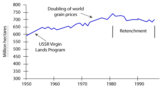
The graph below shows the area of land from which grain was harvested.
Write a report for a university lecturer describing the information in the graph.
Summarise the information by selecting and reporting the main features, and make comparisons where relevant.
» You should write at least 150 words.
World grain harvested area, 1950 – 96
First Step- Analyse :
The given presentation is a line graph. Here, the ‘X’ axis represents the time, and the ‘Y’ axis represents the area in million hectares where grain was harvested. The question is asking to summarise the main features and to make comparisons where relevant.
Second Step- Collecting data/ information:
a) Time: Past (1950 to 1996).
b) Theme: Total land in million of hectares where grains were harvested.
c) Place and Position: All around the world.
d) Main Point: World grain harvested area.
e) General Trend: The amount of land increased from 1950 to 1980, and then this amount decreased.
f) Effects & Result: Virgin land program, Doubling the price of grain, Retrenchment.
g) Conclusion: Not necessary.
Third Step- Report Planning:
A) Writing Introduction:
The given line graph shows the total grain harvested area around the world in million hectares from 1950 to 1996, and the reasons why the amount changed. Here, the ‘X’ axis represents time and the ‘Y’ axis shows the land area in millions of hectares.
B) Writing General Trend:
As is observed from the graphs, total grain harvested area increased until 1980, at which point there was a reduction due to retrenchment.
C) Writing Detailed Description:
According to the given illustration,
D) Describing the results
Not necessary as it has already been described in detail description.
E) Writing the conclusion
Not necessary.
Tips: You should use transitional words to make the writing coherent. Do not copy the sentences from the given question. You are expected to write a summary, so you should never write down all the facts and figures presented in the graph. Never write less than 150 words. Any report writing in the Academic IELTS task 1, which has fewer than 150 words, will be penalised and therefore, the candidate will lose points.
Familiarity with these words would be useful in all IELTS Writing test modules. Common connective words are:
Addition: in addition, and, similarly, likewise, as well as, besides, furthermore, also, moreover, and, then, too, not only … but, even besides, this, that, etc.
Sequence: first(ly), initially, second(ly), to begin with, then, next, earlier/later, after this/that, following this/that, afterwards, etc.
Consequence: as a result, thus, so, therefore, consequently, it follows that, thereby, eventually, then, in that case, admittedly, etc.
Certainty: obviously, certainly, plainly, of course, undoubtedly, etc.
Condition: if, unless, whether, provided that, for, so that, depending on, only if, providing that, etc.
Definition: refers to, means, that is, consists of, etc.
Summary: in conclusion, in summary, lastly, finally, to sum up, to conclude, to recapitulate, in short, etc.
Example: for instance, one example, for example, just as, in particular, such as, namely, to illustrate, etc.
Reason: since, as, so, because (of), due to, owing to, the reason, why, in other words, leads to cause, etc.
Time: before, since, as, until, meanwhile, at the moment, when, whenever, as soon as, just as, etc.
Now, you should be able to write a better IELTS Writing Task 1. Follow the Sample Questions or take the model test provided on this website.
What should I comment?
Amazing Information.
Hi sir, I want to give a mock test
Helpful for me.
Thanks a lot.
The graph illustrates the global crop harvesting areas from 1950 to 1996. The unit is measured in Million hectares. Overall, the area of land from which grain was collected risen from 1950 to 1980, but decreased from 1980 to 1996. The worldwide crop growing fields were around 600 million hectares at the beginning of the period. Then the USSR initiated virgin lands program which dramatically extended the dimension of this area to 650 million hectors in 1960. From 1960 to 1970, fluctuations of the total harvested area could be observed. But the area expanded slightly over the period afterwards. The dimension of the area reached around 700 million hectares in 1775. world grain prices doubled in 1977 and it fueled the increase of this area to approximately 750 million hectares in 1980. Then Retrenchment started in 1980 and it reduced the crop growing area dramatically, although there were some fluctuations of the value over the period, and the world gain harvested area after that decreased slightly until 1996.
From the first sample passage: “As is observed from the two given graphs, the number of male employees was larger in all sectors of employment than that of women but after 20 years this discrimination had plummeted”. Past tense is used for 1975 (i.e. “was”), past perfect is used for 1995 (i.e. had plummeted). Is that correct? 1997 is before 1995. Shouldn’t it be the opposite? Thanks.
The provided graph illustrates the global grain harvesting areas from the years 1950 to 1996 in millions of hectares and the reasons behind some apparent changes of this production. As it is observed from the graphs, the harvested area increased until 1980, when it started to decline during the retrenchment. Initially, 600 million hectares of land was harvested worldwide for the production of grains in 1950. Then the area of land rapidly increased due to the USSR Virgin Lands program, which positively affected the trend. Between the years of 1955 and 1970, there had been minor rises and falls in the amount of area harvested between the margins of 600-700 millions of hectares. A little past 1970, the worldwide doubling of grain prices marked another sharp expansion of the harvested area, dramatically growing the total land by almost 50 million hectares in the span of less than a decade. The numbers appear to be fluctuating up until a little past 1980 where the retrenchment caused the reduction of the harvested land areas.
Hello, I have a question. In this practice task, I am unable to see the graph and question. Here it’s only answered! From where I can get the questions???
May God bless you for these helpful tips 🙂
But I think a conclusion is not required. An overview is a must.
Oh, it is a wonderful website that I found necessary items which help me to get a good band score in IELTS Thank you, IELTS Mentor, and I wish that lessons on writing task 2 would help all the students to score 7+.
Vasu, you can find associated graphs in IELTS sample which is right next to download. Hope, you will be to find it.
I am not able to see any of the line graphs or bar graphs associated with the tasks. Could anyone please help me for the same?
Good one, but it depends on the individual and what question will come in the test. How we attempt that is up to us.
I love it.
It is a great website.
Almost 600 thousand male were employed in manufacturing jobs in 1975 and that was almost twice than the number of women employed in the same sector. Is the above sentence is correct?