IELTS Academic Writing Task 1/ Graph Writing – Line Graph:
You should spend about 20 minutes on this task.
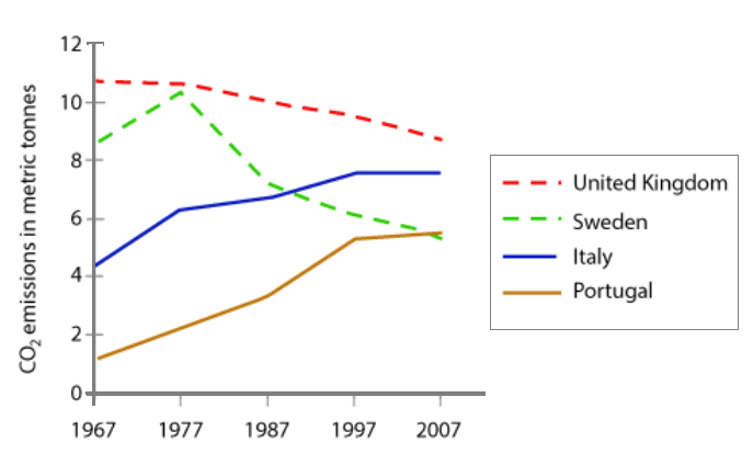
The graph below shows average carbon dioxide (CO2) emissions per person in the United Kingdom, Sweden, Italy and Portugal between 1967 and 2007.
Summarise the information by selecting and reporting the main features, and make comparisons where relevant.
Write at least 150 words.
Model Answer:
The line graph compares the average per capita carbon dioxide emission in four European countries, namely the UK, Sweden, Italy and Portugal, over a forty-year period from 1967 to 2007.
In general, the UK consistently accounted for the highest CO2 emissions per capita, although its figures declined steadily. In contrast, Italy and Portugal started with relatively low levels of average CO2 emissions, but witnessed clear upward trends.
In 1967, an average person in the UK emitted around 11 tonnes of CO2, which was far higher than the figures in other countries. This figure fell gradually throughout the period, reaching roughly 9 tonnes by 2007. Sweden followed a different trajectory: its per capita CO2 release began at about 9 tonnes and climbed to a peak of nearly 11 tonnes in the mid-1970s. After that, the number dropped sharply, falling to just over 5 tonnes by the end of the period.
Italy and Portugal, on he other hand, showed broadly similar trends, although the scale differed. Italy’s per-person emissions increased steadily from about 4 tonnes in 1967 to almost 8 tonnes by 2007. Portugal, which started at only around 1 tonne per person, experienced the fastest growth, reaching approximately 5 tonnes of CO2 emissions per person by 2007.