IELTS Academic Writing Task 1/ Graph Writing – Column Graph:
You should spend about 20 minutes on this task.
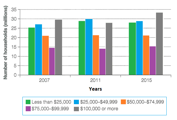
The chart below shows the number of households in the US by their annual income in 2007, 2011, and 2015.
Summarise the information by selecting and reporting the main features, and make comparisons where relevant.
Write at least 150 words.
Number of US households (in millions), by annual income
Model Answer:
The column chart portrays the number of U.S. households in five income brackets for the years 2007, 2011, and 2015. The income categories range from “less than $25,000” up to “$100,000 or more”.
In general, while there was relative stability across the middle-income groups in the USA, households earning $100,000 or more increased significantly over the period, whereas those in the lowest bracket rose moderately and then declined slightly.
In 2007, approximately 25 million households had an annual income of less than $25,000. The number of such families grew to around 28 million in 2011 before retreating slightly to about 27 million by 2015. The $25,000–$49,999 group followed a similar pattern, peaking at 30 million in 2011 and falling back to roughly 28 million in 2015. Meanwhile, the number of households earning $50,000–$74,999 remained remarkably stable at around 21 million throughout the entire period, and the $75,000–$99,999 bracket saw only minor fluctuation, hovering at around 15 million households.
In contrast, the number of US households with over a hundred thousand yearly earnings noticeably grew with an upward trajectory. From under 30 million in 2007, the number of such households dropped slightly in 2011 but then surged to nearly 34 million by 2015, which was the highest figure among all income groups.