IELTS Academic writing task 1 – Line Graph (Part 2)
Links to all Line Graph pages:
Line Graphs with model answer: Part 1 | Part 2 (Current Page) | Part 3 | Part 4 |
Following is the list of IELTS Line graphs (part 2) with the links to sample answers. You should practise these questions as part of your preparation for the Academic IELTS test.
IELTS Line Graph Sample 21 with sample answer
[Line Graph: The graph below shows the proportion of the population aged 65 and over between 1940 and 2040 in three different countries.]

IELTS Line Graph Sample 22 with sample answer
[Line Graph: The graph below shows the consumption of fish and different kinds of meat in a European country between 1979 and 2004.]

IELTS Line Graph Sample 23 with sample answer
[Line Graph: The graph below shows the quantities of goods transported in the UK between 1974 and 2002 by four different modes of transport.]

IELTS Line Graph Sample 24 with sample answer
[Line Graph: The graph below gives information from a 2008 report about consumption of energy in the USA since 1980 with projections until 2030.]

IELTS Line Graph Sample 25 with sample answer
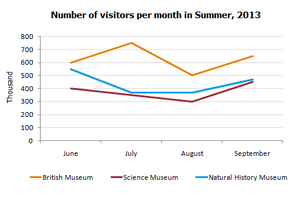
[Line Graph: The line graph below gives information about the number of visitors to three London museums between June and September 2013.]
IELTS Line Graph Sample 26 with sample answer
[Line Graph: The graph below shows radio and television audiences of United Kingdom throughout the day in the year 1992.]

IELTS Line Graph Sample 27 with sample answer
[Line Graph: The graph below gives information about international tourist arrivals in five countries.]

IELTS Line Graph Sample 28 with sample answer
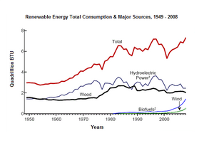
[Line Graph: The diagram shows the consumption of renewable energy in the USA from 1949-2008.]
IELTS Line Graph Sample 29 with sample answer
[Line Graph: The graph below shows four countries of residence of overseas students in Australia.]

IELTS Line Graph Sample 30 with sample answer
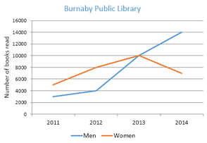
[Line Graph: The graph below shows the number of books read by men and women at Burnaby Public Library from 2011 to 2014.]
IELTS Line Graph Sample 31 with sample answer
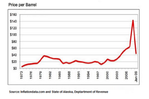
[Line Graph: The line graph shows the historical oil prices per barrel from 1973 to January 2009.]
IELTS Line Graph Sample 32 with sample answer
[Line Graph: The line graph below shows changes in the amount and type of fast food consumed by Australian teenagers from 1975 to 2000.]

IELTS Line Graph Sample 33 with sample answer
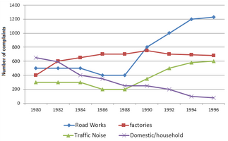
[Line Graph: The graph below shows the number of complaints made about noise to Environmental Health authorities in the city of Newtown between 1980 and 1996.]
IELTS Line Graph Sample 34 with sample answer
[Line Graph: The chart below shows the changes that took place in three different areas of crime in New Port city center from 2003-2012.]

IELTS Line Graph Sample 35 with sample answer
[Line Graph: The line graph shows the projected population growth of China and India.]

IELTS Line Graph Sample 36 with sample answer
[Line Graph: The graph below shows US consumers’ average annual expenditures on cell phone and residential phone services between 2001 and 2010.]

IELTS Line Graph Sample 37 with sample answer
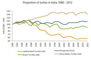
[Line Graph: The graph below gives information on the population of turtles in India from 1980 to 2012.]
IELTS Line Graph Sample 38 with sample answer
[Line Graph: The figure shows demographic trends in Scotland. Summarise the information by selecting and reporting the main feature.]

IELTS Line Graph Sample 39 with sample answer
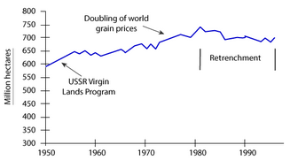
[Line Graph: The graph below shows the area of land from which grain was harvested. Write a report for a university lecturer describing the information in the graph.]
IELTS Line Graph Sample 40 with sample answer
[Line Graph: The graph shows the percentage of UK adolescents following a vegetarian diet.]

Excellent.