Links to all Line Graph pages:
Line Graphs with model answer: Part 1 | Part 2 | Part 3 (Current Page) | Part 4 |
Following is the list of IELTS Line graphs (part 3) with the links to sample answers. You should practise these questions as part of your preparation for the Academic IELTS test.
IELTS Line Graph Sample 41 with sample answer
[Line Graph: The line graph below gives information about men and women smokers in Bhutan from 1960 to 2000.]

IELTS Line Graph Sample 42 with sample answer
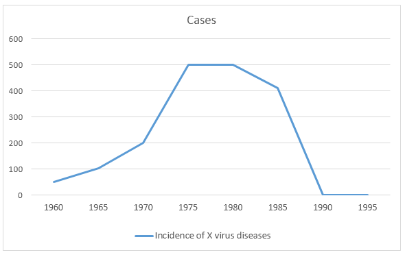
[Line Graph: The line graph below shows the cases of diseases caused by X virus in Australia from 1960 to 1995.]
IELTS Line Graph Sample 43 with sample answer
[Line Graph: The graph below shows the amount in grams of potatoes, pasta and rice eaten in a European country between 1976 and 2006.]

IELTS Line Graph Sample 44 with sample answer
[Line Graph: The graph shows a comparison in the pulse rate changes between two different individuals of different ages and professions.]

IELTS Line Graph Sample 45 with sample answer
[Line Graph: The chart below shows the sales of handmade olive oil soaps to tourists in Turkey in 2015.]

IELTS Line Graph Sample 46 with sample answer
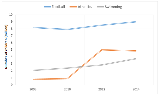
[Line Graph: The graphs below show the average monthly expenditure on children’s sports and participation in different sports in the UK from 2008 to 2014.]
IELTS Line Graph Sample 47 with sample answer
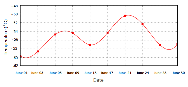
[Line Graph: The graph below shows the average temperature in Antarctica in June 2015.]
IELTS Line Graph Sample 48 with sample answer
[Line Graph: The line graph below shows how much people in four countries spent on purchasing books from 1995 to 2005.]

IELTS Line Graph Sample 49 with sample answer
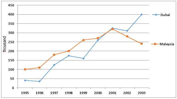
[Line Graph: The number of tourists visiting Malaysia and Dubai from 1995 to 2003 is presented below.]
IELTS Line Graph Sample 50 with sample answer
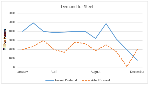
[Line Graph: The line graphs below show the production and demand for steel in million tonnes and the number of workers employed in the steel industry in the UK in 2010.]
IELTS Line Graph Sample 51 with sample answer
[Line Graph: The graph below shows the weekday volume of passenger activity on the Toronto Metro system for July 2007.]

IELTS Line Graph Sample 52 with sample answer
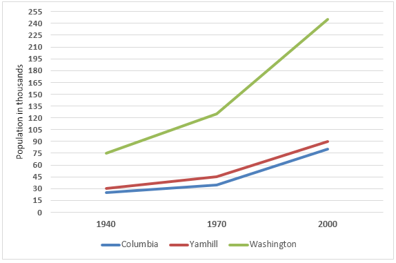
[Line Graph: The graph below shows the population change between 1940 and 2000 in three different counties in the US state of Oregon.]
IELTS Line Graph Sample 53 with sample answer
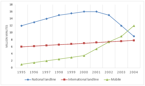
[Line Graph: The chart below shows the total volume of telephone calls (in million minutes) in Denmark, divided into three categories, from 1995- 2004.]
IELTS Line Graph Sample 54 with sample answer
[Line Graph: The graph below gives information about the main purposes of overseas residents’ visit to the UK between 2000 and 2016.]

IELTS Line Graph Sample 55 with sample answer
[Line Graph: The graph below shows the number of enquiries to tourist information office made by telephone, letter/email, and in person from January 2001 to June 2001.]

IELTS Line Graph Sample 56 with sample answer
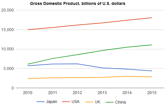
[Line Graph: The graph below shows the Gross Domestic Products (GDP) in four selected countries between 2010 and 2015.]
IELTS Line Graph Sample 57 with sample answer
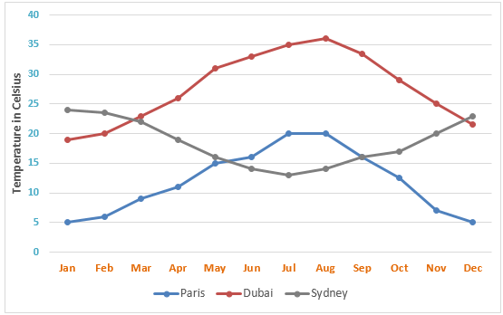
[Line Graph: The line graph below shows the average monthly temperatures in three major cities.]
IELTS Line Graph Sample 58 with sample answer
[Line Graph: The line graph shows thefts per thousand vehicles in four countries between 1990 and 1999.]

IELTS Line Graph Sample 59 with sample answer
[Line Graph: The line graph below compares the Gross Domestic Product (GDP) in four countries in billions of US dollar.]

IELTS Line Graph Sample 60 with sample answer
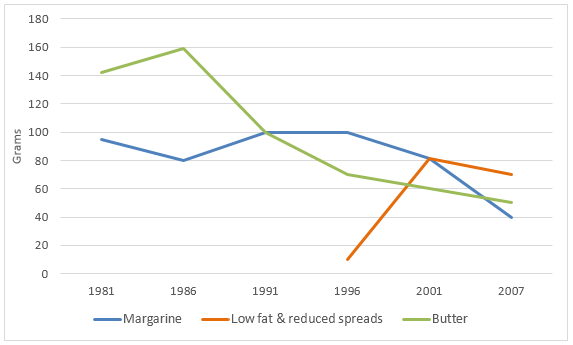
[Line Graph: The graph below shows the daily consumption of three spreads per person from 1981 to 2007 in a country.]