Graph Writing # 193 - Changes in world population by region between 1910 and 2010
- Details
- Last Updated: Wednesday, 26 August 2020 00:02
- Written by IELTS Mentor
- Hits: 61191
IELTS Academic Writing Task 1/ Graph Writing - Pie Charts:
» You are advised to spend about 20 minutes on this task.
The two pie charts below show changes in world population by region between 1910 and 2010.
Summarise the information by selecting and reporting the main features, and make comparisons where relevant.
» You should write at least 150 words.
Sample Answer 1:
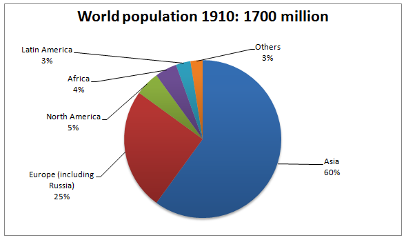
The pie charts compare the population distribution in different regions of the world in 1910 and 2010 and also depicts the changes in global population in these territories. A glance at the diagrams reveals that more than half of the world citizens resided in Asia, both in 1910 and 2010, and the ratio of the global population division decreased in Asia and Europe in a century.
According to the given illustration, in 1910, the global inhabitants was 1.7 billion which overwhelmingly increased and reached to 6 billion in just 100 years. Six out of every ten persons, in 1910, lived in Asia, making it the region with exactly 60% global people. Then Europe and Russia comprised one-fourth of the global citizenry while 3% and 5% of the global community lived in Latin America and North America. Finally, the lowest percentage of the population allotment could be observed in Latin America and African region had one and a half percent more citizen share in this year.
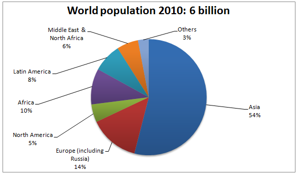
After a century, 2010, to be exact, the population diffusion in different parts of the world changes. More than half of the world population were in Asia, though it is precisely six percent fewer than that of a century back. North America's percentages of the population remained unchanged but made it the continent with the lowest percentage of the world population which was previously held by the Latin America. Interestingly, population distribution in Europe and Russia dropped to almost half while it more than doubled in Latin America and Africa. Finally, six percent people lived in the Middle East and North Africa in 2010 though no data was given for this region explicitly in the first pie chart.
Sample Answer 2:
The pie charts depict the global population shift between 1910 and 2010. At the onset, it is clear that the global inhabitants increased remarkably in just 100 years and the major proportion of it lived in Asia.
As can be seen from the illustration, more than half of the world population lived in Asia in both years. From 1910 to 2010, the percentages of population in Europe, Russia and Asia dropped; European population from 25% to 14% and population in Asia from 60% to 54%. During this time, African's percentage of global population soared from just 4.5% to 10% while in Latin America it jumped from 3% to 8%. The percentage of the population in North America, however, remained constant, staying at 5% both in 1910 and 2010. Then the Middle East and North Africa, representing a new region, accommodated 6% of world population in 2010. The global population percentages in the remaining areas of the world rose slightly from 2.5% to 3%.The global population in a century jumped from 1.7 billion to 6 billion.

In general, while in 1970 the world population was 1700 million, in 2010, this amount increased rapidly to 6 billion and the largest proportion of population used to live in the Asian continent.
In 1910, Asia had the highest percentage of people (60% of total). One in four global people lived in Europe including Russia. The North America and African figures reached 5% and 4% respectively. Latin America had just 3% of the global population this year.
On the other hand, there was a slight fall in the Asian percentage of the global population a century later which was 54%. The figures of Europe suffered the same trend as Asia, with a slight decline to 14%. Looking at the Latin American population, the ratio approximately tripled to 8%. Moreover, in Africa, it climbed significantly as 10% of the world population was from Africa. Finally, the two figures which remained stable were North America (5%) and others (3%).
As is seen from the illustration, the highest ratio of the population lived in the Asian Continent in 1910, which corresponded to 60 per cent, and in 2010, this percentage was 54. It had a marginal drop afterwards, however, it remained the majority. An important fact to notice is that in 1910, the Middle Eastern and North African inhabitants were presented as a part of the other nationalities, which was only 3%. The ratio of this population grew and, therefore, it is shown separately from other ratios which was 6% in 2010. Latin America and Africa population ratio increased, from 3 to 8 percent and from 4 to 10 percent respectively. The proportion of inhabitants in North America did not change and remained almost constant; its participation was about 5% in both years. The opposite happened to the European continent, in which, the global population distribution ratio dropped, in fact, it was the largest drop, from 25% in 1910 to 14% in 2010.
Report