Graph Writing # 74 - Average household expenditures in a country
- Details
- Last Updated: Sunday, 26 July 2020 19:10
- Written by IELTS Mentor
- Hits: 207827
IELTS Academic Writing Task 1/ Graph Writing - Pie Chart:
» You should spend about 20 minutes on this task.
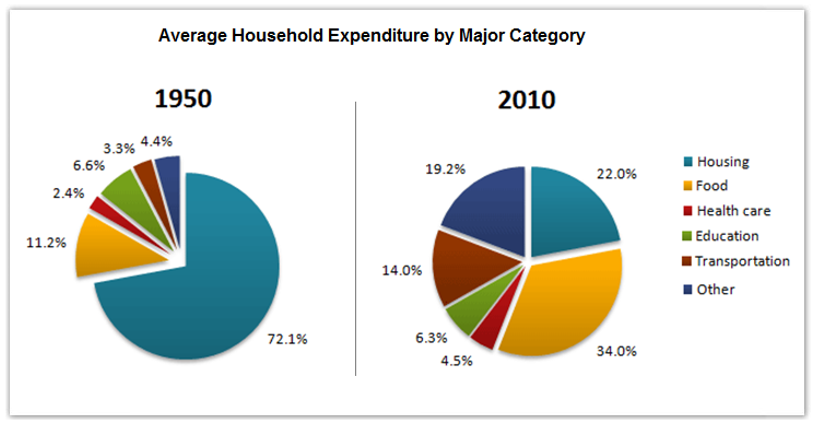
The pie charts below show the average household expenditures in a country in 1950 and 2010.
Summarise the information by selecting and reporting the main features, and make comparisons where relevant.
» Write at least 150 words.
Sample Answer 1:
The two pie charts compare the average nationwide expenses on several household categories including housing, food, healthcare, education, transportation in 1950 and 2010. The expenditure ratio for food soared in 6 decades while an overwhelming portion of the expenditure went on for housing in 1950.
Now turning to the details, the bulk of the expenses in 1950 was made for the housing and food which accounted for a massive 72.1% and 11.2% of the total expenditures. In opposite, it can be observed that people prioritised buying food (34%) more than housing (22%) six decades later. Health care had the lowest amount of money spent on in both of the years. In addition, transportation expenses had remarkably increased by roughly three times from only 3.3% in 1950 to 14% in 2010. Aside from that, spending on other items also rose to 19.3% from 4.4% in 1950. Education expense ratio, however, had slightly decreased where people insignificantly spent 0.3% more in 1960 than in 2010.
To summarise, basic necessities such as food and housing are the two main categories people spent most percentages of money on, however, health care aspect was the least prioritised.
[Written by - Immae]
Sample Answer 2:
The pie charts show the expenses made in housing, food, healthcare, education, transportation and other items in a country in 1950 and 2010. As is observed from the pie charts, in 1950 almost two-third expenditure was in housing whereas this average expenditure has been increased for food, transportation etc. in 2010.
According to the given data, more than 70% expenditure of the people in this country went on in housing in 1950. The second most expenditure in this country was for food. All other expenditures including healthcare, education, transportation etc. were less than 20% in total. After 60 years the trends of expenditure in this country significantly changed. People’s expenditure in housing decreased to only 22% while the expenditure for food increased to just over one-third of the total. Interestingly, the expenditure on education decreased over the time while the expenses for transportation increased to 14%. All other expenditure in 1950 was only 4.4% which increased to roughly 20% in 2010 which indicates the new addition in the category where people started expensing more than they did in 1950.
In summary, the expenditure nature of people had changed significantly in 2010 than that had been in 1950 and it is obvious that expenses on food upsurged.
Model Answer 3:
The two pie charts compare the household outlay in a country by major categories in 1950 and 2010. Overall, in both years, significant expenditure went on for accommodation and food which together covered the most of the expenditure. However, in 2010, spending ratio escalated for the food while decreased for the housing.
In 1950, nearly two-thirds of the expenditure of people went on for the accommodation and more than 11% on food. The expenditure on housing plummeted in 2010, 72.1% to 22.0% while it almost trebled in the case of the food. Healthcare expenditure ratio, on the contrary, was the lowest, only 2.4%, and it increased by almost 2% in 2010. Similarly, the outlay on transportation was elevated in 2010 by nearly 10%. The cost ratio for education was 6.6% in 1950 which slightly decreased after six decades. Other categories attributed to only around 4% expenditure and it roughly quintuple during the period.
In summary, the housing drained the highest percentages of money for the people in this country in 1950 and after 60 years it reduced while the ratio of expense on foods increased remarkably.
[ Written by - Harpreet ]

The graph shows the differences in average household expenses of a nation in 60 years of time span. Overall, housing was the most expensive household category in 1950 and food cost almost trebled in six decades.
In 1950, the household expenditures for housing was around 72.1% of total income - the highest among the given categories. The second highest was for food with 11.2%. For healthcare, the expense ratio was just 2.4%, while for education it was 6.6%. Moreover, 3.3% of the expense was in transportation and finally, 4.4% for other expenses.
In 2010, exactly after six decades, the expense for housing went down to the second position with 22% of total expense. Food stool in the first place with 34% of the total expense. Transportation cost 14% of the total expenditure, while the education expenditure had slightly gone down by 0.3% and stood at 6.3%. Healthcare expenses also had gone up and took 4.5% of the total. And other expenses had increased and it consisted 19.2%.
In detail, an average family in 1950 spent nearly three-quarters of their total spending. This spending witnessed a plunge from 72.1 per cent in 1950 to a low of just 22 per cent in 2010. Their food budget, meanwhile, represented the second biggest spending of households in 1950, which became the highest overall in 2010, reaching at 34 per cent this year.
Moreover, expenditures on other categories such as transportation had increased from 3.3 per cent by 1950 to 14 per cent by the end of 2010. Similarly, the cost of other spendings saw a rising trend, growing from only 4.4 per cent to 19.2 per cent in 2010. The cost of education, however, slightly dropped to 6.3 per cent of total expenditure in 2010. By contrast, the percentage of spending on health care nearly doubled during this period, rising from 2.4 per cent to 4.5 per cent.
Overall, the families in this country spent almost three-quarters of their earnings on housing while the cost of their food increased significantly during this period. Moreover, spending increased noticeably for transportation, but there were corresponding drops to expenditure on things such as housing and education.
Looking at the details, in 1950, people's expenses on housing were approximately three-fifths of their earning. However, in 2010, this share of expense declined and comprised of only one-fifth of the amount. Another significant change worth mentioning is related to food. In 1950, around 11% of expenditure was on it, whereas in 2010, this soared three folds. Besides, drastic changes were seen in transportation and others, whereas in 1950, these two areas comprised of only around 3% and 4% of spending, but it showed a significant rise and reached to nearly 14% and 19% respectively. The ratio of expenses for healthcare changes marginally but remained almost the same for education. In 1950, people in this country spent 2.4% and 6.6% on healthcare and education respectively which reached nearly 4.5% and 6.3% consequentially in 2010.
Overall, a large amount of money was spent on food while in health care, comparatively a low expenditure was made.
In the year 1950, the expenditure portion on food by the people in this country was only 11.2% which increased to 34.0% in the year 2010. Similarly, for commuting, the amount of money spent was 2.4% at the beginning of the year. Then it went up to 4.5% at the end of the year. In addition, the health care budget of people was 3.35% in 1950 and it had jumped up to 14.01% in 2010. In terms of other expenditures by the citizens in this country, there was a major increase from 4.45% to 19.25% in 2010. In the year 1950, housing contained 72.1% expenditure which slumped to just 22.0% in 2010. Aside from these expenses, for education, the expense was only 6.6% in 1950 which declined to 6.3% in 2010.
Overall, there were 6 categories of household expenditures that fell into housing, food, health care, education, transportation and other items. People spent most on housing in 1950 and on food in 2010, whereas the least amount of money was spent on health care across both years.
In 1950, the amount of money spent on housing occupied the majority of expenditures which accounted for 72.1%. This figure dropped dramatically to only 22% by 2010. In contrast, spending on food was the second-highest household expenditure in 1950, increased by 3-folds to just over a third in becoming the largest proportion 60 years later.
On the other hand, there was a palpable surge in the expenditure on health care, transport and other items from 2.4%, 3.3% and 4.4% to 4.5%, 14% and 19.2% respectively over the period given. Interestingly, the proportion of education expenditure was relatively stable at a mere below 6.5% in both years.
In general, the largest proportion of expenditure was for housing in 1950 whereas spending on food overtook housing in 2010, becoming the main expenditure category among the six categories.
In details, the average household spent almost two-third of their earning on housing in 1950. This ratio dropped to nearly one-fifth in 2010, which denotes a significant decrease. Cost on food, however, showed a contrasting trend. In 1950, people spent just 11% to buy food which dramatically rose to exactly 34% - more than one-third of their total income. While both expenditures on transportation and other increased by more than 10% over 60 years, there was a slight drop in the percentage of education expense from 6.6% to 6.3%. Transportation cost increases significantly as well, from 4% of their income to 14% of their income in 60 years. Finally, health care remained as the smallest payment in both years, at 2.4% and 4.5% respectively.
[Note: We have first reviewed and edited your report and then published it on our website. So it may look a bit different than your original writing.]
The pair of pie charts elucidate average domiciliary expenses for the years of 1950 and 2010 in 6 major household categories like housing, food, healthcare, education, transportation and others in a country.
Overall, average accommodation cost was overwhelmingly high in this country in 1950 which reduced in recent years while food cost increased many-fold.
The first diagram clearly promulgates that the amount of money spent on housing was the highest in 1950 which was about 72% of total household expenses followed by the nearly 11% cost for food. However, 6 decades later, an obverse scenario could be observed where the call for edibles hiked to approximately 3 times than in 1950, leaving behind the expenses being made in housing at just 22% in 2010.
Furthermore, an appreciable amount of growth can be seen in the divisions of public ease like 'Transportation' and 'Others', covering over 14% and just over 19% of the entire cost in 2010. Also, the healthcare sector rolled to double its expense requirement to 4.5% than that in 1950. Finally, average expenses education was 6.6% which interestingly has slightly decreased after 60 years than that of 1950.
[Remark: In our review, your report has received a band score of 6.5, which could have been 7.0 if there was no spelling and minor grammatical mistakes. Moreover, please note that the data is about expenses by the average household, it is not about investment.]
Report