Graph Writing # 22 - Transport used to travel to and from work in European city
- Details
- Last Updated: Saturday, 18 July 2020 22:04
- Written by IELTS Mentor
- Hits: 107183
IELTS Academic Writing Task 1/ Graph Writing - Column Graph:
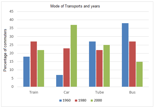
The graph below shows the different modes of transport used to travel to and from work in one European city in 1960, 1980 and 2000.
Write a report for a university lecturer describing the information below.
» You should write at least 150 words.
» You should not spend more than 20 minutes on this task.
Sample Answer 1:
The diagram delineates the type of transportations citizens of a European country used to travel to and from their workplaces in three different years - 1960, 1980 and 2000. As an overall trend, cars gained a huge popularity as the mode of commuting while bus lost its appeal as a viable mode of communication to these Europeans.
As the diagram suggests, around four out of ten of these Europeans used buses to reach their offices and to get back homes in 1960. Tubes were the second most prefered mode of transportation as more 25% people took this form of vehicle. Interestingly, Only around one in every 18 people used cars to travel while trains were preferred by roughly 18% citizens for commuting to and from offices. After two decades, trains and personal cars gained their demands as more than half of the population used these two forms of transports. Tubes and buses retained less proportion of commuters in this year and buses seem like lost its attraction as a mode of transportation.
Finally, in 2000, more than one-third of these Europeans started using cars while only 15% of them used buses to travel to and from their workplaces. Tubes retained almost one-fourth of the commuters while train usage stood just above 20%.
Sample Answer 2:
The given bar graph shows data on the type of transportation used to go to work and to return from the work in three different years. As is noticed from the given data, private car has become the most popular mode of transportation for the office goers and over time the popularity of bus has decreased.
Initially, in 1960, around 20% people used trains, 7% people used cars, 28% people used tubes and around 40% people used buses to go to work or to return from work. After 20 years, the popularity of train and car increased while the popularity of tube and bus decreased. In this year, more people used train than any other transportation as their mode of office transportation. The least used type of transportation was the tube and personal car in 1980. Finally, in 2000, the scenario changed and the car became the most popular mode of transportation which was used by more than 37% people. The second most popular transportation was tube while train and bus became the least preferred mode of transportation.
As is observed, people started preferring private cars over the public bus and train over the time.
(Approximately 195 words)
Model Answer 3:
The provided bar graph compares the types of transportation used by commuters in one European city in three different years commencing from 1960. Four transportation types- train, car, tube and bus are compared in the graph and it is evident that in this European city people used buses in early years but started preferring cars and tubes in later years to reach and return from their workplaces.
As is observed in the given diagram, the majority of the commuters (about 38%) in this city used buses in 1960. The use of tube comprised over 25% while approximately 19% passengers used trains. Only 6% passengers used cars in this year which was quite fewer than the percentage of other transportation users. After 20 years, the percentages of the train and the car users increased significantly while tube and bus users decreased. In this year (1980), more than 22% users used cars and the percentages of train users exceeded the passengers of bus users. Finally, in the year 2000, the percentages of car users rocketed and reached to bout 37%. The percentages of other transportation users decreased except for the tube that was used by 1 out of four passengers in this year. Interestingly the use of bus decreased to only 15% and that was lower than the commuters of any other transportation type to commute to and from their offices.
Sample Answer 4:
The provided bar graph gives information on the four types of transports used in one European city during 1960, 1980 and 2000. As evident from the chart, major changes were observed in the usage of cars and buses and cars become the most preferred transportation type in the later year.
In 1960, the maximum proportion of people travelled by bus (about 38%) compared to the 6% car owners. On the contrary, in 2000 around 37% population preferred travelling by cars, whereas only 15% bus passengers were there. The proportion of people who used tubes for transportation remained on an average between 20% to 30% during the 3 years period. It shows that tubes were popular even in later years. On the other hand, commuters who travelled by train increased from 19% in 1960 to 28% in 1980. However, the figures reduced to 22% by 2000. Cars and buses as transportations showed an opposite trend in their popularity.
To summarise, there was a tremendous rise in the usage of cars for travelling to and from the office from 1960 to 2000.
[Written by - Tintu]

Overall, the number of commuters on buses dropped gradually while the amount of commuters on a car rose significantly. Moreover, the percentage of commuters by tube and train fluctuated steadily.
First of all, the most commonly used transport in 1960 was the bus whereas the vehicle with the lowest number of commuters was the car. Afterwards, the train had approximately 17% of passengers. Therefore, the tube users' percentage was a bit higher at about 27%.
Secondly, in 1980 the bus and train had the highest percentage of passengers at approximately 28% while the tube hit the bottom being lower than the car by nearly 2%.
Finally, in 2000, the ratio of car users rocketed and peaked at almost 37%. In contrast, the percentage of bus commuters' number plummeted and bottomed out. Additionally, the tube user's ratio grew a little whereas the number of train users fell.
Overall, people in this city mostly relied on bus for going to and from work in 1960, whereas cars replaced buses as primary transportation after 40 years. Moreover, the popularity of using tubes and trains as public transports remained almost the same.
In details, around 38% of people in this European city used buses to travel for professional reasons in 1960 followed by about 27% commuters who preferred tubes. In the same year, the number of people who took trains was over twice than that of car users (about 18% train users against around 7% private car users). On the other hand, train and bus takers, after two decades, became exactly equal at about 27%. Likewise, car use nearly resembled the proportion of tube in 1980 (about 22%).
Regarding the transportation use ratio among different professionals in 2000, over one-third of commuters had chosen cars. As for train and tube, the ratio was about 22 and 25 per cent respectively. However, buses served the least percentage of commuters with the figure showing exactly 15% in 2000.
Overall, it can be seen that people mostly relied on buses for going to work in 1960, whereas cars replaced buses after 40 years as their favourite means of transportation. Moreover, the popularity of using cars while commuting to work increased over time as opposed to buses, whose use declined.
Around 38 percent of people depended on buses at the time of going to and from their office in 1960 followed by about 27 percent who preferred tubes. In the same year, the ratio of people taking trains was over two times than that of cars (about 18 percent for trains and around 7 percent for cars). On the other hand, train and bus takers after two decades became exactly equal at about 27 percent. Likewise, people's proportion going to and from their workplaces by car nearly resembled the number by tube in 1980 (about 22 percent). Moreover, around 30 percent of people had chosen cars. As for train and tube, the figures were about 22 and 25 percent respectively. However, buses served the least number of commuters with the figure showing exactly 15 percent.
As is observed from the given data, in the earlier year - in 1960 to be more specific, buses were the most popular transportation system in this city while the car was less frequently used. Interestingly, after two decades the car was the most popular transport choice of the dwellers and the buses were less frequently used.
It is evident that in 1960 around 38 per cent of travellers in this city used buses for commuting, making it the most popular choice of transportation. Tubes were the second-most popular transportation system as around 27 per cent of citizens used them this year. Personal car users were just 7 per cent. However, after two decades, in 1980, the scenario changed significantly. Around this time, train and bus users in this city were around 26 per cent each, and among 21 per cent commuters used tubes. Interestingly, the use of cars increased almost three times in just 20 years.
Finally, in 2000, the car used reached to staggering 37 per cent. This year cars became the most popular choice for commuters while just 15 per cent of them used buses. Tube users were exactly 25% while train users this year accounted for over 20%.
Report