Graph Writing # 149 - Results of surveys in 2000, 2005 and 2010 about one university
- Details
- Last Updated: Tuesday, 25 August 2020 23:46
- Written by IELTS Mentor
- Hits: 115312
IELTS Academic Writing Task 1/ Graph Writing - Table:
» You should spend about 20 minutes on this task.
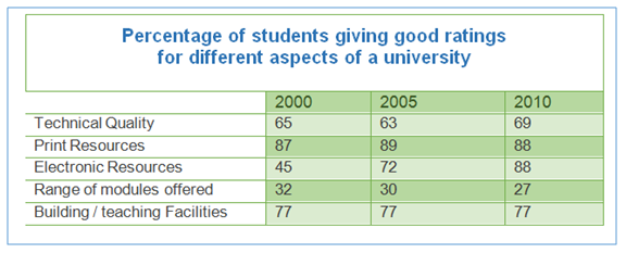
The table below shows the results of surveys in 2000, 2005 and 2010 about one university.
Summarise the information by selecting and reporting the main features, and make comparisons where relevant.
» Write at least 150 words.
Sample Answer:
The table data illustrates the proportion of students who gave good ratings to various aspects of a university in three different years - 2000, 2005 and 2010.
Overall, it is clear that the percentage of students who gave good ratings to five different aspects of the university were comparatively higher in 2010 than previous years with the exception of the range of modules offered by the university.
To begin with, 65 percent students rated the technical quality of the university as excellent in 2000 and this ratio remained more or less the same in the next two surveys. The most striking feature of the data is that there was a significant rise in the percentage of students who rated electronic resources as good. It started off at 45% in 2000, rose to 72% in 2005 and finally, the figure almost doubled in 2010, which was 88%. From 2000 to 2010, there were fluctuations in the percentage of students who gave a good rate for the print resources and also the range of modules offered. While print resources received a steady good rating, 87 to 89 percent, range or major offered received a lower rating in 2010, just 27% rated it as "good". The modules offered by the university had a lower percentage of good ratings in 2010 than in 2000. Finally, it is interesting to note that the building and teaching facilities remained constant in its percentage of good ratings by the students over the given period - 77% positive rating.
[Written by - Lee Wing Qeen]

Summarise the information by selecting and reporting the main features, and make comparisons where relevant.
The given table represents the survey result from the feedback in which students of a university rated different good aspects of this university. The data provided is for the year 2000, 2005 and 2010 and the rating was done on five aspects of the varsity.
Overall, the majority of pupils positively rated print resources while the range or module offered received the least favoured rating.
To illustrate, print resources had shown constant growth in the survey and was favoured by the most percentage of students in the university - 88% in the year 2010 from as early 87% popularity. Interestingly, the percentage of students who rated the building/teaching facilities as positive remained constant at 77% in 2000, 2005 and 2010.
A slight increase in the percentage of technical quality from 2000 to 2010 could be observed. However, Electronic resources as a good feature of the varsity had shown drastic growth as they received a more favourable rating. It was just 45% in 2000, which skyrocketed to 88% just in ten years. Finally, the range of modules offered was not a very popular aspect of the university as per the survey participants. Its popularity decreased from 32% in 2000 to 27% in 2010.
Report