Graph Writing # 176 - How energy is used in an average house in a European country
- Details
- Last Updated: Thursday, 11 August 2022 20:21
- Written by IELTS Mentor
- Hits: 204456
IELTS Academic Writing Task 1/ Graph Writing - Pie Charts:
» You are advised to spend about 20 minutes on this task.
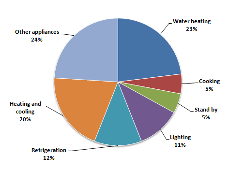
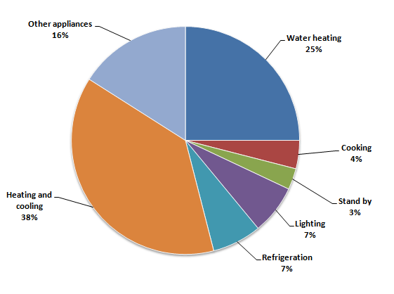
The first pie chart shows how energy is used in an average house in a European country. The second chart shows the percentage of greenhouse gas emissions from this energy use in this country.
Summarise the information by selecting and reporting the main features, and make comparisons where relevant.
» Write at least 150 words.
The percentage of household energy use:
The percentage of greenhouse gas produced:
Sample Answer 1:
The first pie chart illustrates the average energy usage in a typical family in a European country while the second pie chart shows the percentage of greenhouse gas emissions from this energy consumption.
As a general trend, water heating and heating & cooling systems require the highest energy in the households in this country, and these areas of use also produce the highest percentage of greenhouse gas for this country.
According to the first pie chart, the water heating system consumes more than 20% of total energy consumption in a household while the heating and cooling systems require one-fifth of the total energy. Refrigeration consumes 12% energy which is higher than that of energy requirement for cooking and lighting. Finally, 5% of energy is consumed in standby mode and the remaining 24% energy is required for all other household appliances.
As the second pie chart suggests, heating and cooling systems contribute to the highest percentage of greenhouse gas emissions which is 38%. Water heaters, though require more energy than heating and cooling, emit comparatively lesser greenhouse gas (25%). These two systems produce the highest percentage of greenhouse gas in this country. Cooking, lighting and refrigeration generate 18% greenhouse gas in total, and all other appliances and standby modes generate 19% greenhouse gases.
Sample Answer 2:
The first pie chart compares the power consumption in a typical house whereas the second one presents data on the percentages of greenhouse effects of these power-consuming equipment in a European country.
As a general trend, the more energy a household appliance use, the more greenhouse gas it emits.
As can be seen, water heating and keeping the house warm or cool consume almost half of the energy required in an average family in this country. Cooking, standby and lighting all together utilise around 20% power while refrigerators alone need 12% electricity. All other appliances consume the rest of the one-quarter energy share in this state.
Interestingly, there is a correlation between the percentage of energy a particular device requires to run and the percentage of greenhouse gas this device produces with the exception of heating and cooling device. Heating and cooling devices emit the highest percentages of greenhouse gas though they consume less power than water heaters. Other devices contribute to emitting dangerous gases based on the percentages of energy they require to function. Heating water, warming and cooling the rooms attribute to more than half of the total greenhouse gas emissions. Cooking, stand by and lighting combinedly contribute to 14% gas production which is almost the same as the amount produced by other appliances in a house.
[Written by - Olivia]

Overall, heating and water heating account for the largest share of household energy consumption, whereas standby power usage is the smallest. However, greenhouse gas emissions do not always align with energy consumption, as certain categories contribute disproportionat ely to emissions.
In detail, water heating is the most significant energy-consuming activity, making up 23% of total household energy use. Heating and cooling the house follows closely, accounting for 20% of energy consumption. Together, these two categories represent nearly half of total household energy usage. Other appliances consume 24% of energy, while refrigeration and lighting account for 12% and 11%, respectively. Cooking and standby power use the least energy, both at 5%.
When it comes to greenhouse gas emissions, home heating and cooling systems remain the biggest contributors, at 38%. The water heater comes next and contributes to a quarter of the total greenhouse gas emissions. Despite using 24% of total energy, other appliances generate 16% of greenhouse gases. Refrigeration, cooking, and lighting contribute 7%, 4%, and 7% of emissions, respectively, while standby power accounts for just 3%.
Overall, the biggest proportions of energy are used for water heating and the highest proportion of greenhouse gas emissions is caused due to heating and cooling rooms.
Looking at the energy use, the proportion of water heating is the biggest in terms of energy use, at 23%. Following that, this figure for heating and cooling rooms makes up 20%, which is the second highest. The proportion of other appliances is more than that of refrigeration, at 24% and 12%, respectively. The least amount of energy, 5%, is used for cooking, and this share accounts for almost half of lighting (11%).
Regarding greenhouse gas emissions, the biggest contributor is heating and cooling rooms - which account for 38% of total greenhouse gas emissions. The second largest source is water heating which contributes to one-fourth of total emissions. Other appliances and refrigerators in combination produce 23% of greenhouse gas, and cooking and lighting houses seem to contribute just 7% together.
Overall, it is observed that water heating along with other heating and cooling systems require the most energy to function. Additionally, they also contribute to the majority of greenhouse gas production.
As the data suggests, water heating uses 23 percent of the total energy required in a household in this country. Interestingly, the proportion of greenhouse gas emissions from water heating (25%) bears a striking resemblance to its ratio of use. But on the other hand, other heating and cooling activities produce 40% of the gas despite running on only 20% of the energy requirement.
Another look at the graph suggests that refrigeration and lighting both emit 7 percent greenhouse gas and consume approximately 10 percent energy. The figures for standby mode and cooking were also similar, around five percent in both energy consumption and gas emissions. And finally, other appliances use 24% energy and produce 16% gas which causes greenhouse effects.
Report