Graph Writing # 88 - Participation in education and science in developing and industrialised countries
- Details
- Last Updated: Monday, 30 May 2022 19:43
- Written by IELTS Mentor
- Hits: 163743
IELTS Academic Writing Task 1/ Graph Writing - Column Graph:
» You should spend about 20 minutes on this task.
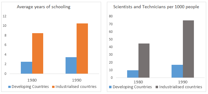
The charts below show the levels of participation in education and science in developing and industrialised countries in 1980 and 1990.
Write a report for a university lecturer describing the information shown below.
» You should write at least 150 words.

Sample Answer 1:
The bar charts compare the average years of education, learners' participation in science-related career as well as research spending in developing and developed countries from 1980 to 1990.
According to the first bar graph, the average years of schooling in developing countries was only about 2 while this was over 8 years in industrialised countries in 1980. After ten years, the number of year in school on an average increased both in the developing and industrialised countries reaching just over 3 years in developing countries while over 10 years in developed countries.
According to the second graph, the number of Scientist and Technician was much higher in developed countries than the developing countries. The percentage of Scientist and Technician in developing countries both in 1980 and 1990 was below 20 while this was around 50 on an average in developed countries.
Finally, the third graph represents that the amount spent on Research and Development in industrially developed countries was much higher than the spending in developing countries. In 1980 the spending was around 50 billion US dollar in developing countries while this amount was more than 150 billion US dollar in developed countries. Interestingly, after 10 years the spending in Research & Development in developed countries was doubled while that amount decreased almost by 50% in developing countries.
Sample Answer 2:
The given bar graphs compare the educational involvements of students in term of total years of education and their participation in science-related subjects in developing and industrial countries from the year 1980 to 1990.
As is presented in the first bar graph, average years of schooling in developing countries were approximately 2 years while in industrial countries schooling years were over 8 years in 1980. Interestingly after one decade schooling years in developing countries magnified to over 3 years while it surged to over 10 years in industrial countries.
As is observed from the second bar graph, the number of scientists and technicians were much higher in industrial countries than in developing countries. Percentage of scientists and technicians were less than 20 percent in developing countries from 1980 to 1990 while it was just over 40 percent in 1980 which soared to approximately 70 percent in 1990.
According to the third bar graph, it can be seen clearly, spending on research and development in industrial countries was far higher than developing countries. The spending in 1980 in developing countries was around 50 billion US dollars while it was 150 billion dollars in industrial countries. Ultimately, after a decade spending on research and development slumped significantly almost 50 percent while spending in industrial countries peaked to approximately 350 billion US dollars respectively.
[ Word Count= 218 | Written by - Faisal Ali ]

The first bar chart illustrates the scenario of students average years of schooling in developing countries, which was as low as 2 years in 1980. Whereas in developed countries, it was more than 8 years. After a decade, in 1990, developing countries stood on about 4 years of average schooling by their citizens while in developed countries, the figure crossed 10 years.
The second chart shows that the number of scientists and technicians in developing countries per 1000 people was fewer than 10 in 1980 and fewer than 20 in 1990. On the contrary, in industrialized countries, it increased was over 40 in 1980 which almost doubled after 10 years.
Finally, the last chart delineates the decline of expenditure of developing countries on research and development. It decreased about 50% in 10 years while in developed countries it almost trebled.
Report