Graph Writing # 101 - Changes in annual spending by a particular UK school
- Details
- Last Updated: Thursday, 04 August 2022 07:56
- Written by IELTS Mentor
- Hits: 400997
IELTS Academic Writing Task 1/ Graph Writing - Pie Chart:
» You should spend about 20 minutes on this task.
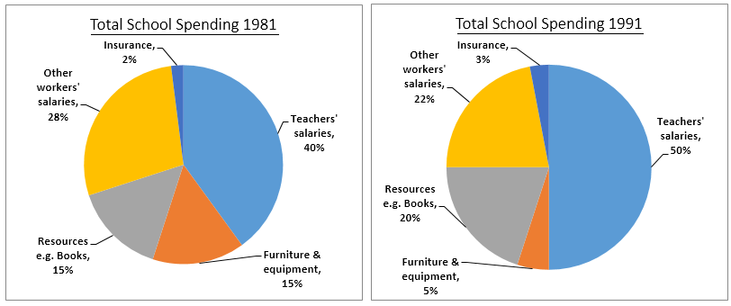
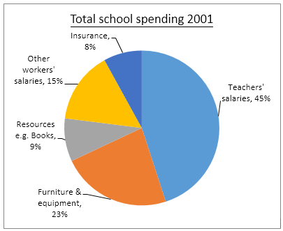
The three pie charts below show the changes in annual spending by a particular UK school in 1981, 1991 and 2001.
Summarise the information by selecting and reporting the main features, and make comparisons where relevant.
» Write at least 150 words.
Sample Answer 1:
The pie charts depict the shifts in annual expenditure by a certain UK school in three different times, 981, 1991, and 2001. In general, teachers’ salaries were the highest proportion of annual spending percentage. In contrast, insurance was consistent as the lowest percentage of annual school spending over the times observed.
Looking at the details, in 1981 teacher’s salaries accounted nearly a half, 40% of total school costs and increased significantly in 1991 which accounted exactly a half, 50% and remained the highest spending in 2001 as well, 45%. Meanwhile, other worker’s salaries, references, and furniture and tool fluctuated and amassed big percentage of school disbursement all together, it was about 40% in average.
On the other hand, insurance was the lowest percentage of total school spending overall observed years. It was only 2% of total spending in 1981 and remained the tiniest fraction subsequently in 1991 and 2001, 3% and 8% respectively.
[ Written by - Linda ]
Sample Answer 2:
The given pie charts illustrate a UK school's annual spending and show the changes over two decades.
As is seen in the provided pie charts, the school spent an increasing percentage of money on teachers' salaries, with the maximum of 50% being spent in 1991, after which it was reduced by 5% in 2001. Also, this remained the area, where the highest percentage of the money was spent, in the given three years. Expenditure on other workers' salaries decreased significantly over the years with 28%, 22% and 15% in 1981, 1991 and 2001 respectively.
Again, the percentage spent on resources like books also decreased after a slight increase of 5% in 1991. Investment on furniture and equipment saw a substantial decline from 15% to 5% in the first 10 years, before increasing again up to 23% in 2001. Finally, the least percentage of annual spending was on insurance over the two decades, with a small hike from 2% in 1981 to 8% in 2001.
[ Written by - Priyanka Anchaliya ]
Sample Answer 3:
A glance at the three given graphs reveals some differences among the expenditures per year of a British school in a period of three years: 1981, 1991, 2001.
Overall, it can be seen that there are many trends that are obviously illustrated in those charts: upward, downward and both upward and downward. The changes of those features can be divided into two main groups on account of their trends: single trend and couple trends group.
Starting with the first group, insurance and other workers’ salaries, in 1981, the insurance only took two percent of the total, however, in twenty years later, the number experienced a considerable growth of six percent to eight percent. Unlike the insurance, the salaries of other workers witnessed a respective drop from approximately thirty percent to a mere fifteen percent in about twenty years.
Moving on to the second group, we can see that both teachers-salaries’ and resources’ proportions significantly fluctuated. In the first ten years of the period, the numbers rose five and ten percent to reach fifty and twenty percent, however, slipped dramatically in the next years from fifty to forty-five and from twenty to a mere nine percent. In contrast, furniture and equipment spending first experienced a decrease and then quickly climbed from five percent in 1991 to twenty percent, a growth of eighteen percent.
It is interesting to note that through approximately twenty years, the total spending on different things of this UK school changed considerably.
[ Written by - Quynh Tran ]
Sample Answer 4:
The pie charts depict the amount spent by a school in the UK annually for the years 1981, 1991 and 2001.
As is observed from the pie charts, teachers’ salaries accounted for the highest percentage for both the years and insurance had the smallest proportion of money spent by the UK school in both three selected years.
In 1981, 40% of the total school spending was used for teachers’ salaries and it has increased to 50% of the total amount in 1991. In 2001, the percentage dropped a little, which was 45% which was 5% higher than that in 1981. The money spent on other workers’ salaries decreased gradually from 1981 to 2001. It was initially 28% in 1981, declined to 22% in 1991 and eventually dropped to 15% in 2001.
The spending on furniture and equipment and resources such as books were the same in 1981, which was 15% of the total amount. Whereas in 1991, more money spent on resources than furniture and equipment, 20% and 5% respectively, but the reverse is true for the year 2001. 23% of the spending was for the purpose of buying furniture and equipment and only 9% of the amount for the resources like books. Starting from the year 1981 to 2001, the amount spent on insurance increased steadily. Only a small proportion of money allocated for insurance in 1981, which was 2 %, increased to 3% in 1991 and 8% in 2001.
[ Written by - Lee Wing Qeen ]
Sample Answer 5:
The pie charts give information on the spending of a UK school in three different years with the 10 years interval starting from 1981.
According to the given data, in 1981 the UK school’s 40% expense was for teacher’s salary while 15% expenses were both for the school equipment and for other resources like books. 2% of it expenses was made for the insurance and remaining 28% was for the other staff’s salary. After 10 years the expenses in teachers’ salary increased by10% while the expenses on school furniture reduced by 10%. Resources and books related expenses increased by 5% while other staffs’ salary decreased by 6% this year. Only one percent expenses increased for the insurance.
In 2001, the expense of this school in this year was 45% for the teachers. The insurance cost increased to 8% while the furniture related expenses increased to 23% and staff salary and resource purchasing expenses decreased to 15% and 9% respectively.
Sample Answer 6:
The pie charts overall information about the shift in yearly expenditure at a certain UK schools in the three deferent years: 1981, 1991, and 2001. Overall, the proportions of educators’ paycheck was the highest amount spent in the mentioned years compared to other expenditure areas. Meanwhile, insurance had the lowest contribution in term of money spending.
To begin with, the figure of educators’ salaries was exactly 40% in 1981. Ten years later, it increased to a half of total expenditure. However, in 2001, there was a tiny decrease in spending in the same categorised to 45%.
Furthermore, other employees’ salaries also showed huge proportion on budgeting after educators’ salaries. This area slightly declined in the observed years from 28% in 1981, 22% in 1991 and just 15% in 2001.
There was, however, a field which improved gradually in annual expenditure. It was insurance which continually rose. The percentages were 2 %, 3% and 8% respectively from 1981, 1991 and 2001. The high improvement was shown between 1991 to 2001 which increased by 5 %. Yet, insurance was still the bottom in money spending than other areas.
[ Written by - Waode Eti ]
Sample Answer 7:
The supplied pie charts compare the annual spending made by a school in the UK for three respective years which are 1981, 1991, and 2001. Overall, the salaries for teachers remained the highest portion in spending while insurance was the least expenses over the 20-year time frame.
Based on the pie charts, aforementioned, teachers’ salaries constituted the highest percentages of the school cost which were 40%, 50%, and 45% for 1981, 1991, and 2001 chronologically. The expenses on resources such as books followed the trend of teachers’ salaries, went up in 1991 and dropped in 2001. In 2001, this expenditure stood at 9%. As for the other workers’ salary which was 28% in 1998, showed a dramatic drop to 15% in 2001. It is interesting to note that the percentage of furniture and equipment in 2001 overtook the percentage of other workers’ salaries and it showed a significant rise in 2001 even though it experienced a slight drop in 1991. This cost was 5% in 1991 and 23% in 2001. On the other hand, insurance accounted for the minimum percentage of expenditure over the time frame with 2% in 1991 and 8% in 2001.
[ Written by - Lee Swet Ying ]
Sample Answer 8:
The pie charts compare the expenditure of a school in the United Kingdom in three different years - 1981, 1991 and 2001, with a gap of a decade. It is clear from the pie charts that teachers’ salaries accounted for the highest percentage of the school’s expenses in all three years. By contrast, insurance was the smallest cost in each year.
Now turning to the details, In 1981, 40% of the school’s budget went on teachers’ salaries. This figure rose to exactly the half of the total expense in 1991, before dropping back by 5% in 2001. The proportion of expenditure on other workers’ wages was considerably lower than that of teachers' salaries and it fell steadily over the 20-year period, from 28% of the budget in 1981 to 15% in 2001. Expenditure on insurance stood at only 2% of the total in 1981, being the lowest percentage of expense for the school, but rose to 8% in 2001. The expense percentages for resources and furniture/equipment of the school fluctuated. The cost ratio for resources was the highest in 1991, one-fifth of the total cost to be precise, and the percentage of spending on furniture and equipment reached its peak in 2001, at 23%.
[ Written by - Dr Ali Ahmad ]

Overall, during these years, the highest amount of money was spent on teacher's salaries, while the lowest was on insurance.
When looked in detail, in 1981 the salaries of teachers accounted for 40% of total school spending. It was followed by other worker's salaries, which was 28%. As for the resources and furniture categories, both showed equal spending, 15% of the total. The minimum money went out on insurance, which was merely 2%.
Regarding the spendings of 1991, it is clear that half of the money was spent on teacher's salaries. The amount of money paid to other worker's formed 22% of the total. And one-fifth of the school's fund was allocated to provide sources for students, such as books. Insurance spending this year increased by 1%.
In 2001, 45% of the school's money was spent to pay the teachers. Other staffs wages had been 15%, which was the lowest ratio in comparison with past years. However, in that year, furniture and equipment utilized by teachers and students cost 23% to school officials. For the other categories, it can be seen that resources needed 9% of money and insurance cost 8%.
Overall, it can be seen that most of the spending was for paying teachers' salaries. At the same time, the figure for insurance remained the lowest throughout the period despite its continuous increase.
To begin with, teachers' salaries represented 40 per cent of the school's spending in 1981. After 10 years, the proportion rose by one-quarter before decreasing to 45 per cent in 2001. The purpose of improving furniture and equipment had even more fluctuations, as the figure in the year 1991 (5%) was one-third than that of a decade ago but then increased almost 5-fold by the end of the given 20-year period.
The representation of other workers' salaries declined steadily from 28% in 1981 to as low as 15% in 2001. Conversely, insurance accounted for a mere 2% initially but after 20 years, the figure increased. As for resources such as books, they accounted for exactly one-fifth in 1991 but then dropped to just below 10% in 10 years.
It is also worth noticing that at the beginning of the period, the spending on teachers' salaries was exactly 20 times that on insurance. However, in 2001, the former was less than 6 times the latter.
Starting at 40% in 1981, the yearly spending on teacher's salaries reached a peak of 50% in 1992 then fell to 45% in 2001. Meanwhile, a significant decline was seen in the annual expenditure on other worker’s salaries from 28% in 1981 to 15% in 2001 in this school.
After climbing from 15% in 1981 to 20% in 1991, the annual expenditure on resources dropped sharply to 9% in 2001. In contrast, the spending on furniture and equipment fell from 15% in 1981 to 5% in 1991 then went up dramatically to 23% in 2001. Similarly, a rising trend can be seen in yearly spending on insurance from 2% in 1981 to 8% in 2001.
In general, teachers' salaries accounted for over 40% of the expenditures in the three periods, while insurance costs represented the lowest fraction of the total for those years.
A deeper analysis of the given data allows us to recognize a trend for other workers’ salaries, which had a marginal decrease from 1981 to 1991, and a more considerable decline in 2001, losing 7 percental points of participation in the expenditures. Moreover, while insurance costs were the most insignificant ones for these years, they showed a steady increase from 1981, when they made up 2% of the total, to 2001, when they were the source of roughly 10% of the expenditures of the school.
All in all, although there are some recognizable patterns from one year to another, the school expenditures have remained evenly distributed between the different categories through time.
Answer: The given pie charts illustrate the percentages of alteration in yearly expenditure on five various purposes, namely- insurance, teachers’ salary, furniture and equipment, school resources, and other workers’ salaries, in a school in the UK between the years of 1981 and 2001.
Overall, the highest ratio of spending fo that school was for masters' salary and expenses on resources like books began to shrink over time.
Getting back to the details, the spending on insurance increased significantly and quadrupled in 20 years, from 2% to 8%. By contrast, it can be seen that the other workers’ salaries decreased considerably and almost halved from 28% to 15%. Additionally, it is obvious that the proportion of the expenditure on teachers’ salary was exactly equal to the sum of the other segments, in the year of 1991. Besides, the cost of the other workers’ salaries and resources like books decreased in 20 years, from 28% and 15% to 15% and 9%, respectively, the expenditure of other 3 purposes slightly increased. The spending on teachers’ salaries had the most important proportion for all years.
As per information provided by diagrams, In 1981, 40% of the total school expenditure was accounted for teacher's salary. It slightly increased in the year 1991, with 50%, and then gradually decreased to 45% in 2001. The annual spending on other workers' salaries slowly decreases during the given decades; it went to 9% from initial 28%. In the case of resources, the total spending was 15% in 1981 but it steadily rose to 20% then it again dropped to 9% in 2001. In contrast to this, insurance had the lowest percentage of annual expenditure while it grew in the span of the given period, with 2%, 3% and 8%, correspondingly .
Overall, it can be seen that teacher's salaries were accounted for the highest percentage of this school's expenditure whereas insurance had the lowest proportion of money spent by this UK school.
It can be clearly seen that the teachers’ salaries constituted the highest proportion of annual spending.
According to the data given on the pie charts, in 1981, educators’ wages was 40% and that maintained the first place on the list of total school spending followed by other workers’ salary which was 28%. The appropriation of funds spent on resources and furniture showed the same rate - 15%. Moreover, the least proportion was spent on insurance which comprised only 2% of the total spending. However over this span of a decade, in 1991, the percentage of money spent on teachers’ payrolls increased by 10%, resources e.g. books spending increased by 5% while the school spending on furniture and equipment, other workers’ salaries decreased by 10% and 4% respectively. Furthermore, insurance expenditures rose by 1% and reached 3%.
In the year 2001, the quantity of money spent on tutors’ wages far exceeded the same figure for furniture and equipment by 45% to 23%, while this figure was 15% for other workers’ salaries, 9% for resources and 8% for insurance.
Report