IELTS graph 247 - How the prices of apples and oranges changed
- Details
- Last Updated: Wednesday, 02 August 2017 16:59
- Written by IELTS Mentor
- Hits: 22154
IELTS Academic Writing Task 1/ Graph Writing - Bar/Column Graph:
» You should spend about 20 minutes on this task.
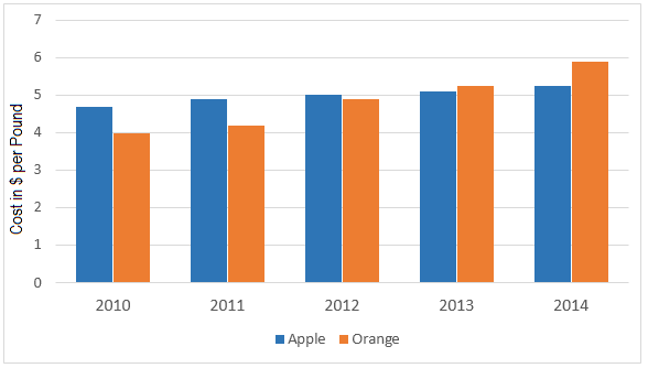
The graph below shows how the prices of apples and oranges changed between 2010 and 2014 in Australia.
Summarise the information by selecting and reporting the main features and make comparisons where relevant.
Write at least 150 words.
Prices of Apples and Oranges from 2010 to 2014
Sample Answer:
The bar graph compares price variations of apples and oranges in Australia over a 5-year period, commencing from 2010. Overall, the price of these two fruits went up every year and orange became more expensive than apples in later years despite a reverse price scenario in early years.
According to the diagram, per pound apple cost approximately 4.5 dollars in 2010 in Australia. At that time, the price of per pound orange was 4 dollar. Next year, the price of both fruits increased and it took roughly 5 dollars to purchase one pound apple while per pound orange was sold at just over 4 dollars. Interestingly, the price of apple and orange in 2012 became almost identical – 5 dollar. After a year, orange was slightly expensive than apple as their prices were nearly 5 dollars 10 cents and 5 dollars 20 cents respectively. In the final year, 2014, the orange became even more expensive than apples. At that time, apple was sold for roughly 5 dollars 20 cents per pound while it was approximately 70 cents more for the same amount of orange.

Report