IELTS Bar Graph (Part 3)
- Details
- Last Updated: Saturday, 24 March 2018 20:07
- Written by IELTS Mentor
- Hits: 69138
IELTS Academic writing task 1 - Bar Graph (part 3)
Links to all Bar Graph pages:
Bar Graphs - | Part 1 | Part 2 | Part 3 | Part 4 | Part 5 | Part 6 | Part 7 |
'IELTS bar graphs (part 3)' page lists down 20 more Bar Graph questions (sample 41 -60) with answers. Those Bar graphs are taken from real IELTS test and you should practise those samples for your Academic IELTS test.
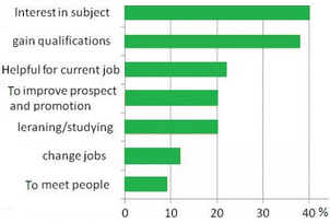
IELTS Bar Graph Sample 41: with model answers
[IELTS Bar Graph: The charts below show the result of a survey of adult education. The first chart shows the reason why adults decide to study. The pie chart shows how people think the costs of adult education should be shared.]
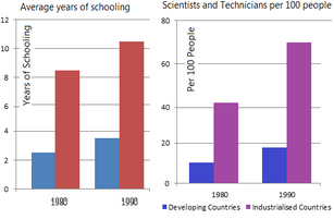
IELTS Bar Graph Sample 42: with model answers
[IELTS Bar Graph: The charts below show the levels of participation in education and science in developing and industrialised countries in 1980 and 1990.]
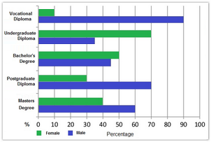
IELTS Bar Graph Sample 43: with model answers
[IELTS Bar Graph: The chart below show the different levels of post-school qualifications in Australia and the proportion of men and women who held them in 1999.]
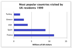
IELTS Bar Graph Sample 44: with model answers
[IELTS Bar Graph: The charts below give information about travel to and from the UK, and about the most popular countries for UK residents to visit.]
IELTS Bar Graph Sample 45: with model answers
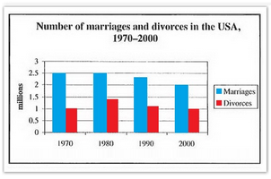
[IELTS Bar Graph: The charts below give information about USA marriage and divorce rates between 1970 and 2000, and the marital status of adult Americans in two of the years.]
IELTS Bar Graph Sample 46: with model answers
[IELTS Bar Graph: The chart below shows information about changes in average house prices in five different cities between 1990 and 2002 compared with the average house prices in 1989.]
IELTS Bar Graph Sample 47: with model answers
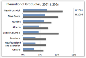
[IELTS Bar Graph: The chart below shows the percentage change in the share of international students among university graduates in different Canadian provinces between 2001 and 2006.]
IELTS Bar Graph Sample 48: with model answers
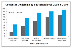
[IELTS Bar Graph: The graphs below give information about computer ownership as a percentage of the population between 2002 and 2010, and by level of education for the years 2002 and 2010.]
IELTS Bar Graph Sample 49: with model answers
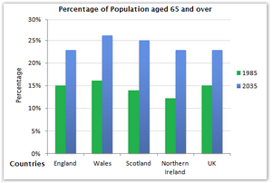
[IELTS Bar Graph: The chart below gives information about the UK's ageing population in 1985 and makes predictions for 2035.]
IELTS Bar Graph Sample 50: with model answers
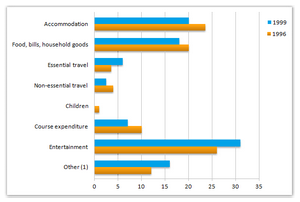
[IELTS Bar Graph: The chart shows student expenditure over a three-year period in the United Kingdom.]
IELTS Bar Graph Sample 51: with model answers
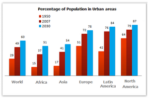
[IELTS Bar Graph: The bar chart below gives information about the percentage of the population living in urban areas in the world and in different continents.]
IELTS Bar Graph Sample 52: with model answers
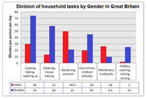
[IELTS Bar Graph: The chart shows the division of household tasks by gender in Great Britain.]
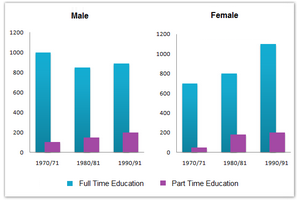
IELTS Bar Graph Sample 53: with model answers
[IELTS Bar Graph: The chart below shows the number of men and women (in thousand) in further education in Britain in three periods and whether they were studying full-time or part-time.]
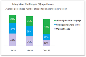
IELTS Bar Graph Sample 54: with model answers
[IELTS Bar Graph: The chart below shows information about the challenges people face when they go to live in other countries.]
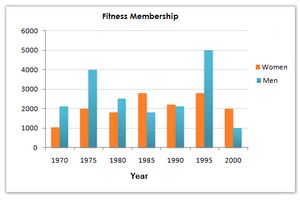
IELTS Bar Graph Sample 55: with model answers
[IELTS Bar Graph: The chart below shows male and female fitness membership between 1970 and 2000 in Someland.]
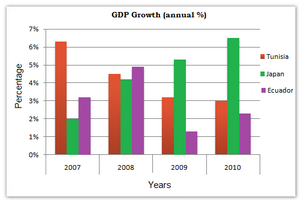
IELTS Bar Graph Sample 56: with model answers
[IELTS Bar Graph: The chart below shows the GDP growth per year for three countries between 2007 and 2010.]
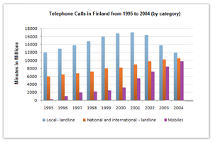
IELTS Bar Graph Sample 57: with model answers
[IELTS Bar Graph: The chart below shows the total number of minutes (in millions) of telephone calls in Finland, divided into three categories, from 1995 – 2004.]
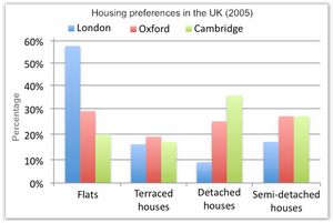
IELTS Bar Graph Sample 58: with model answers
[IELTS Bar Graph: The following chart illustrates the results of a British survey taken in 2005 related to Housing preferences of UK people.]
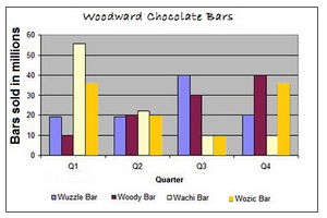
IELTS Bar Graph Sample 59: with model answers
[IELTS Bar Graph: The graph below shows the quarterly sales figures of Woodward chocolate bars for 2010.]
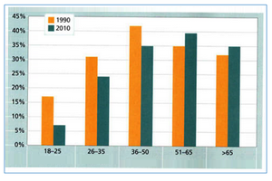
IELTS Bar Graph Sample 60: with model answers
[IELTS Bar Graph: The chart below gives information on the percentage of British people giving money to charity by age range for the years 1990 and 2010.]
« Previous (Bar Graph 21- 40) Next (Bar Graph 61-80) »

Report